Brand Overview
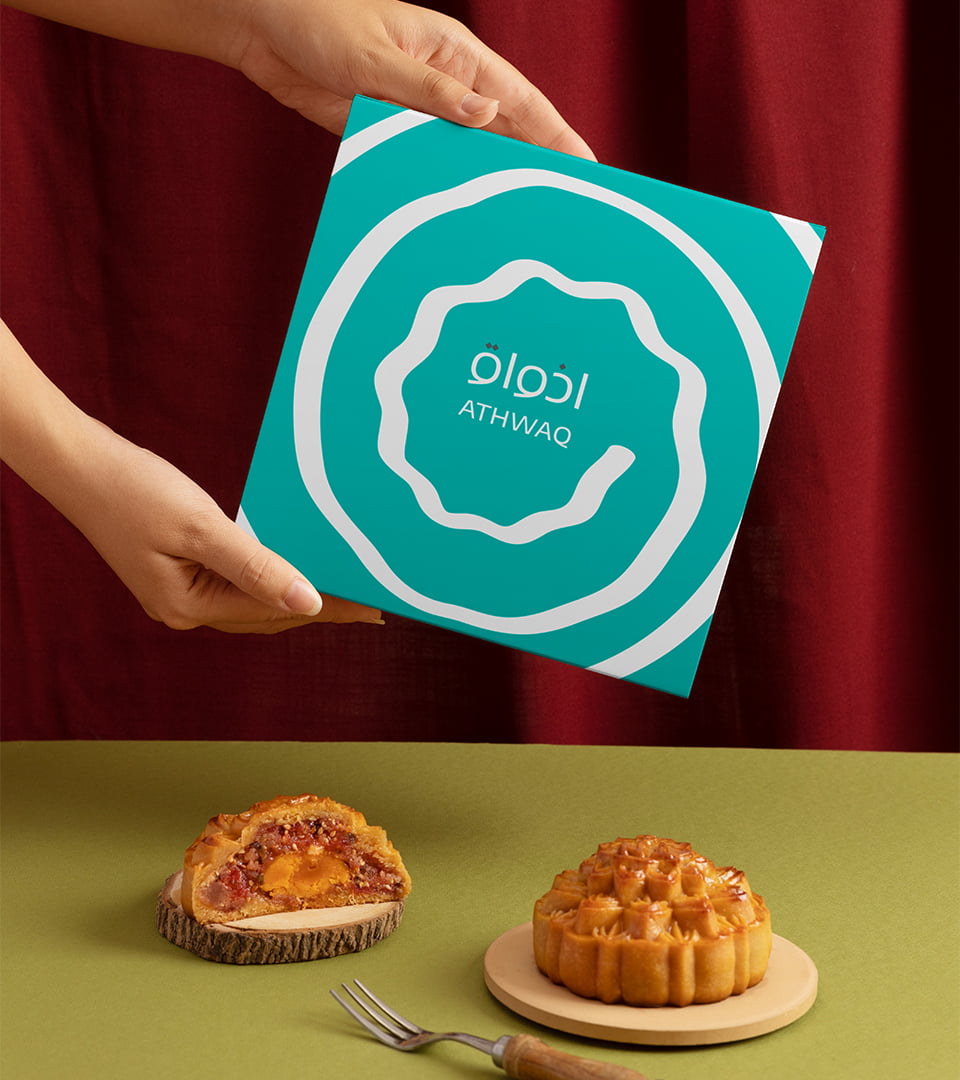
Steeped in Arabic heritage, Athwaq began as a beloved local brand known for its delectable "Balah-Elsham" sweets.
They witnessed a growing global market for sweets, a symphony of flavors that resonated with diverse palates.
Challenge
Athwaq's existing brand, while successful locally, didn't resonate with a broader audience.
It spoke the language of tradition but lacked the global appeal needed to attract a wider customer base and compete in a more diverse marketplace, so they need to rebrand to successfully reach a more global market.
Brand Overview
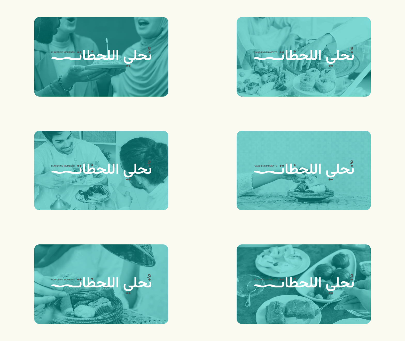
The inception of the brand key theme "Flavoring Moments" stems from Athwaq's commitment to transforming every sweet encounter into a distinct celebration.
Brand Mark Approach
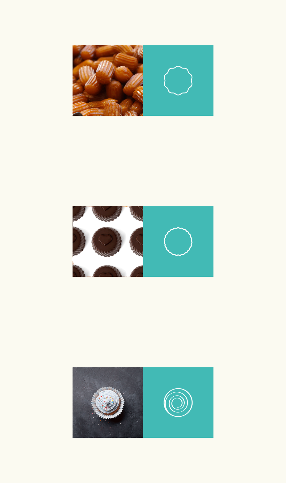
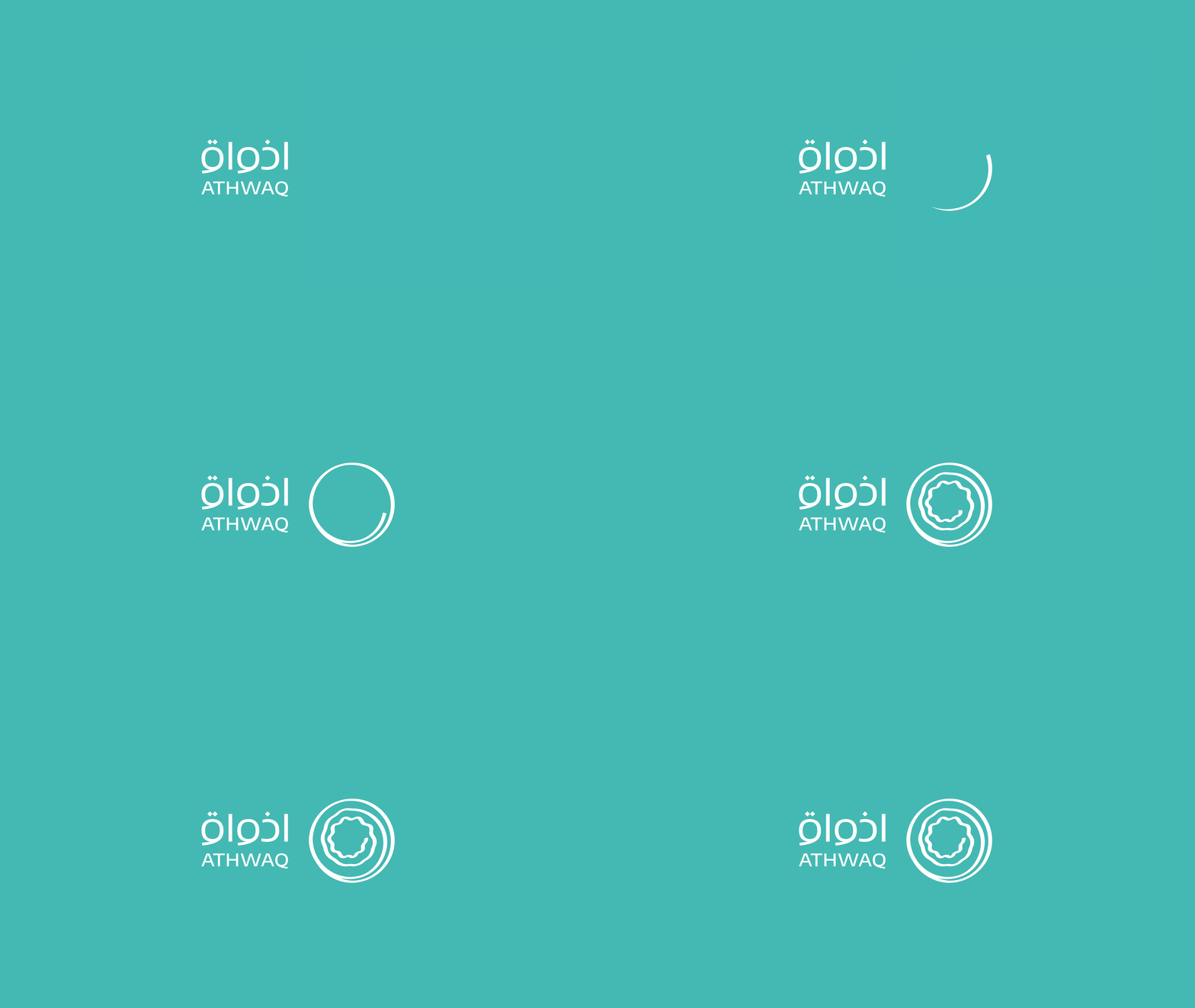
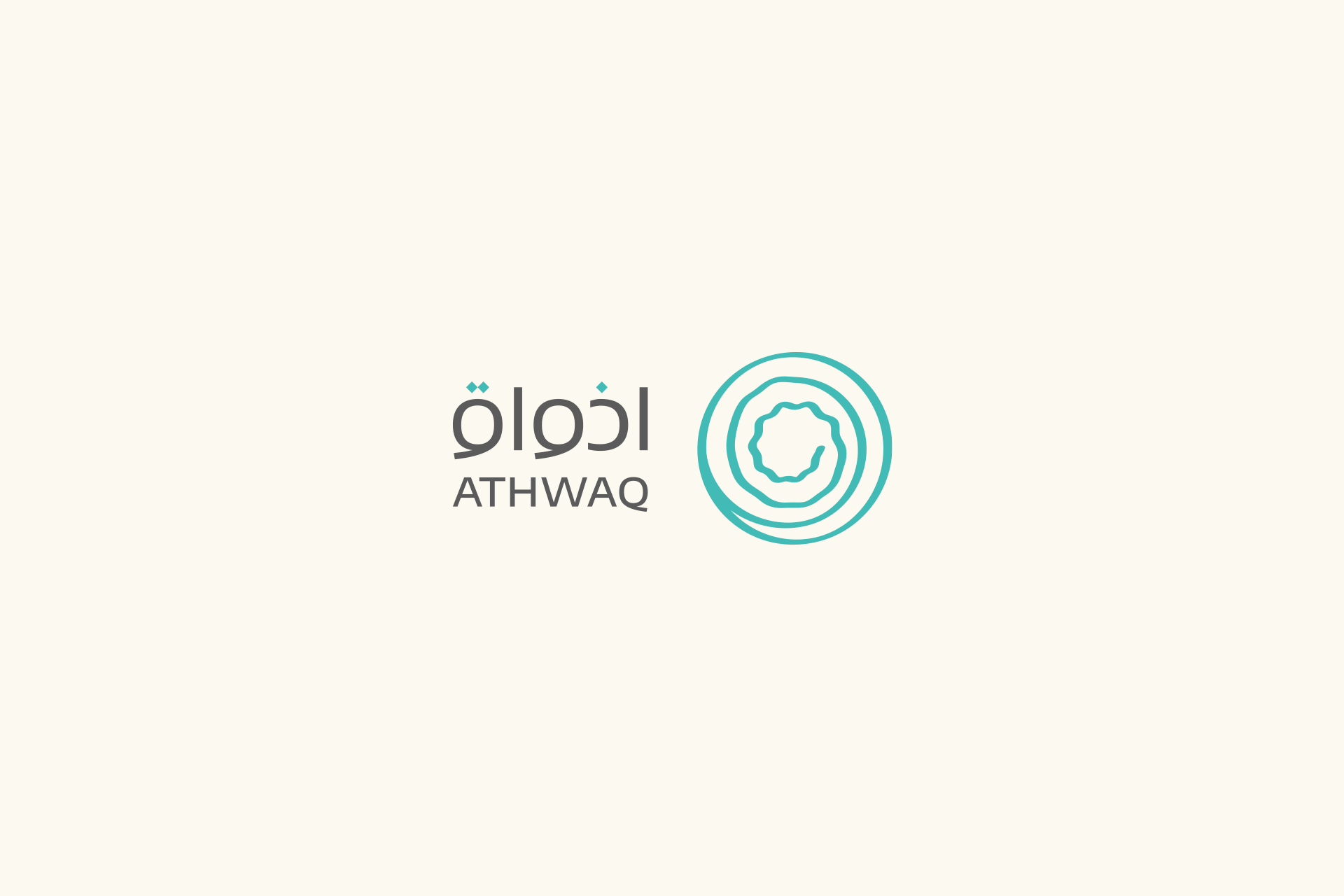
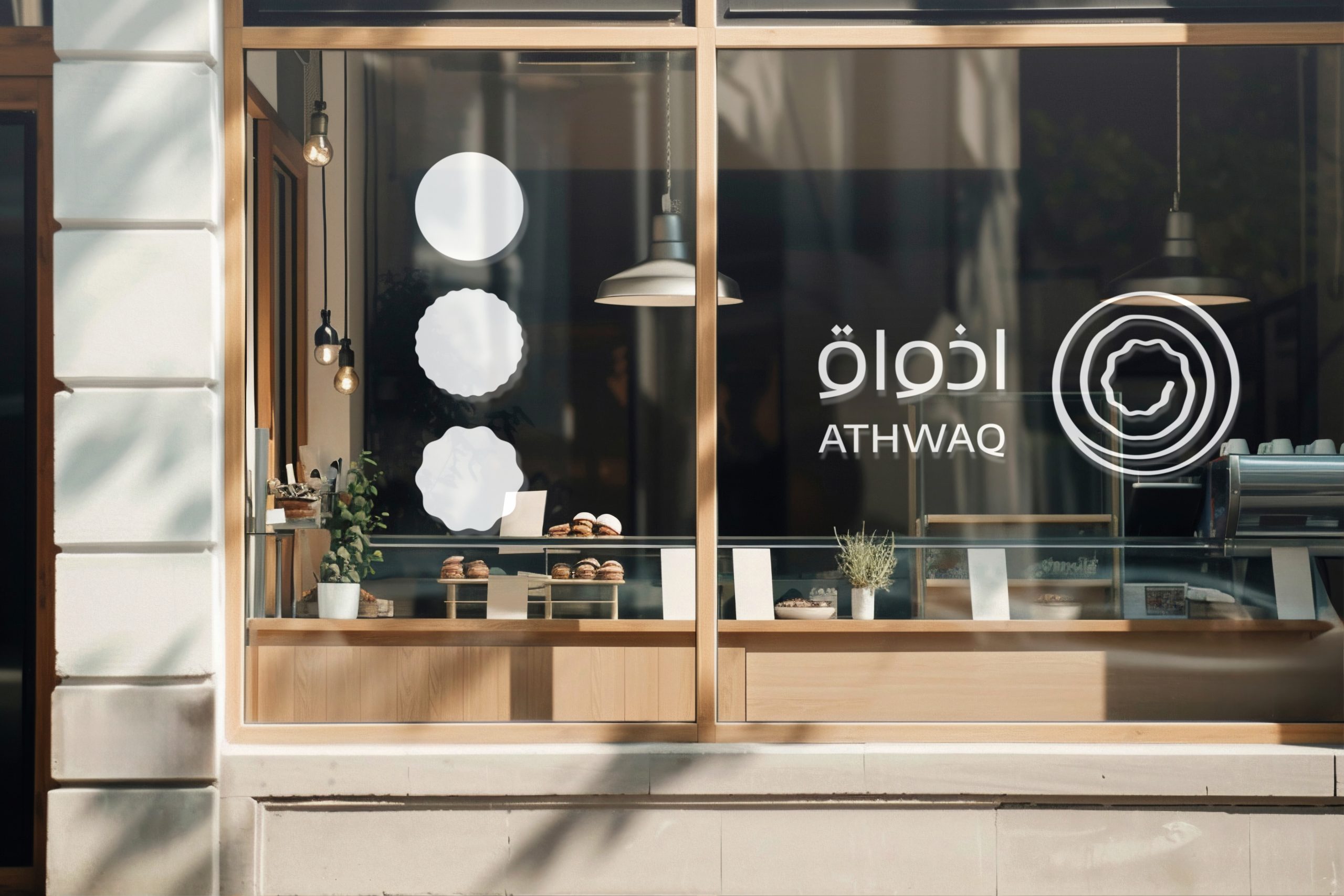
Blends symbolic elements from Eastern and Western sweets, harmonizing diverse offerings through smooth, curved lines that represent friendliness, luxury, and simplicity while maintaining consistent quality.
Art Direction
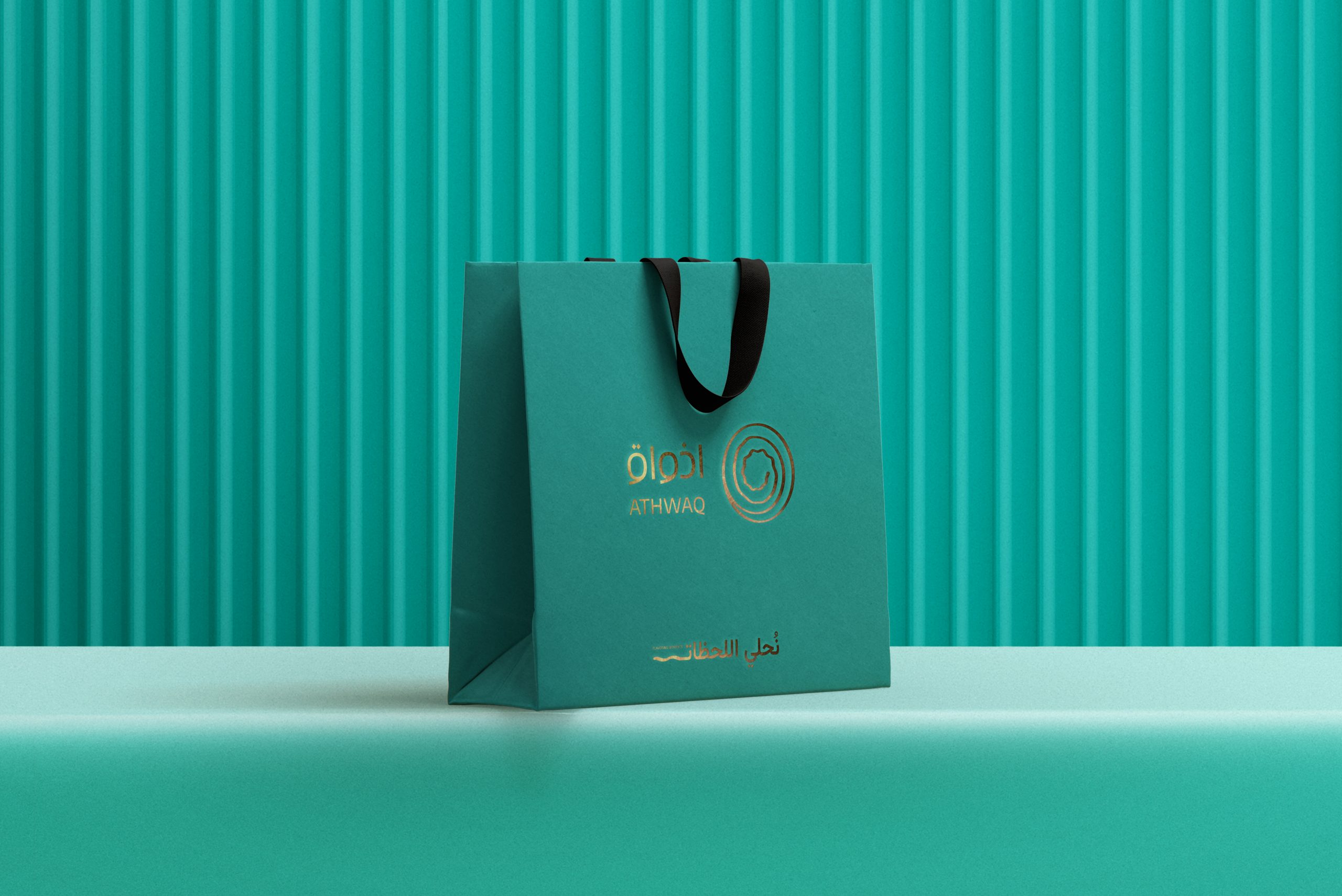
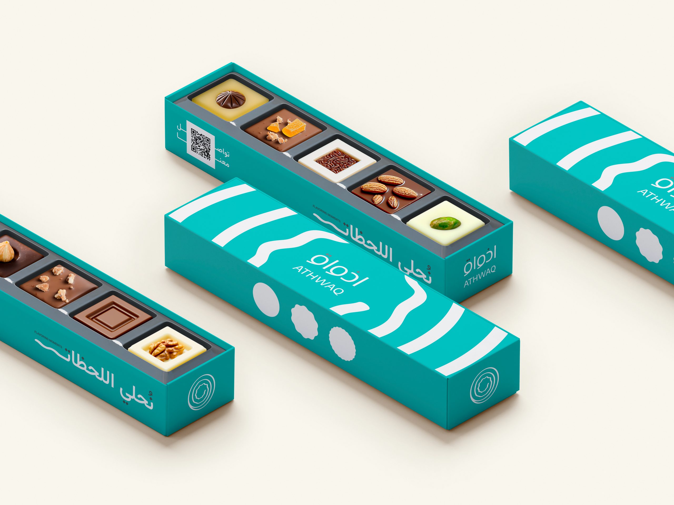
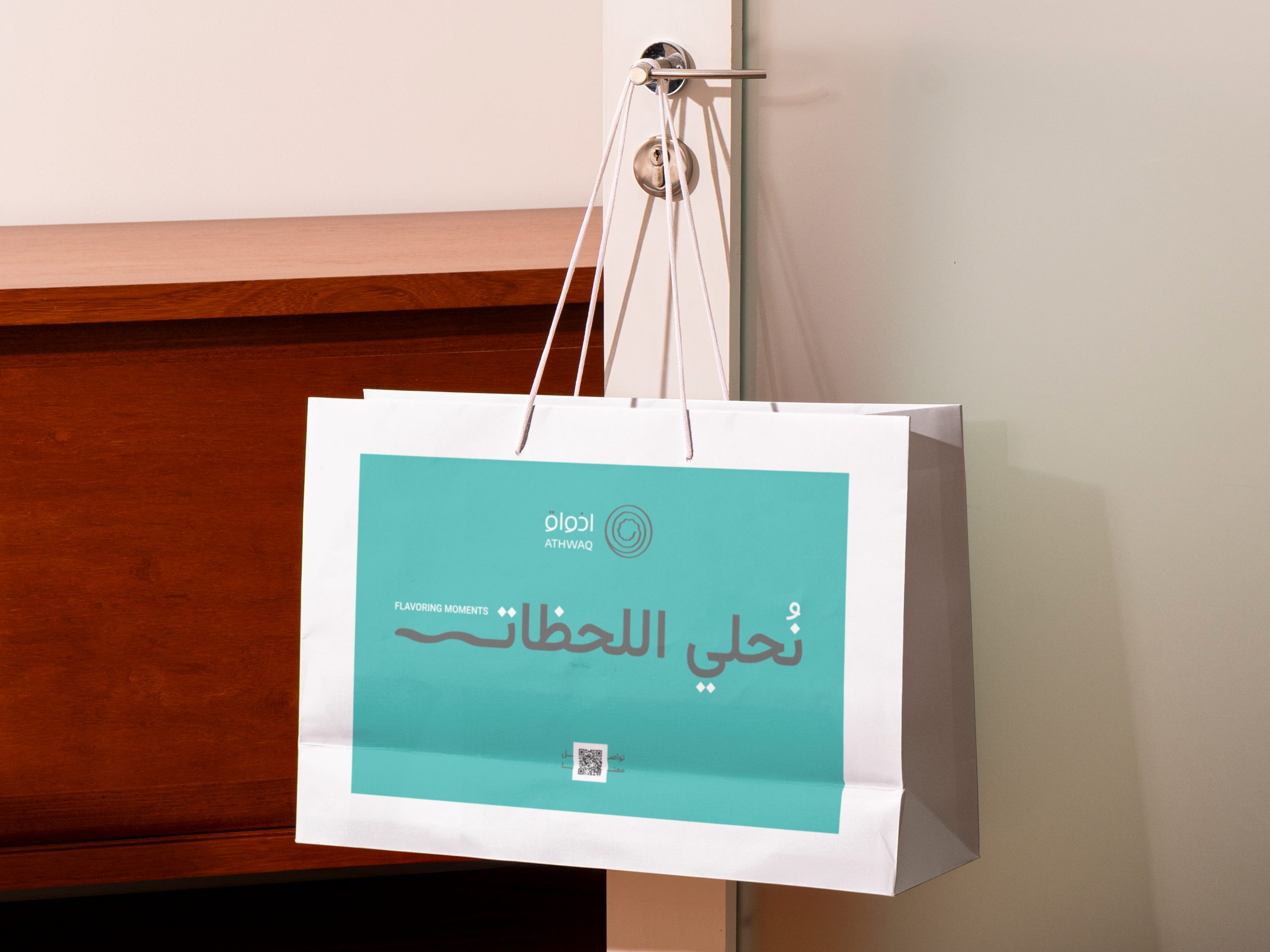
Developed a contemporary, globally inspired aesthetic that harmoniously blends modern elements with Athwaq's rich heritage, creating a visually captivating and cohesive brand experience across all platforms.


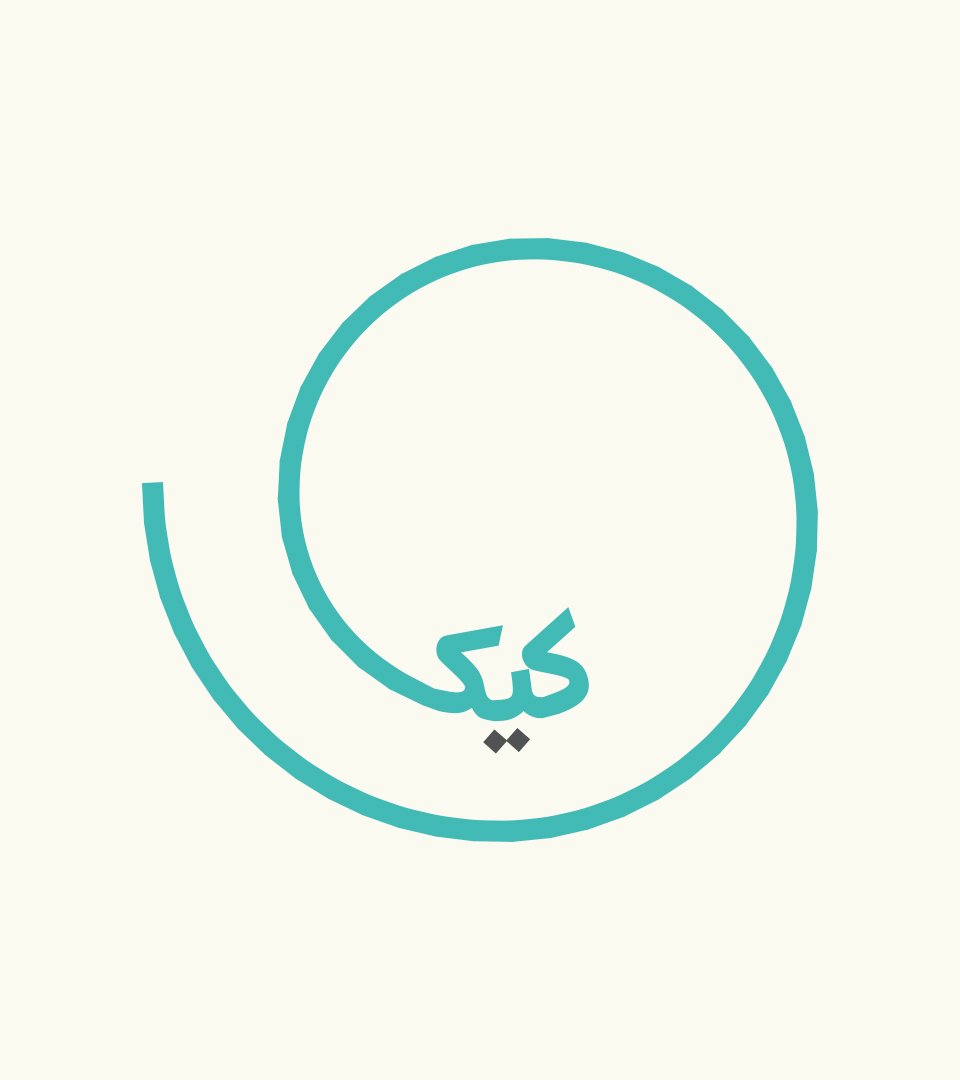
Art Direction
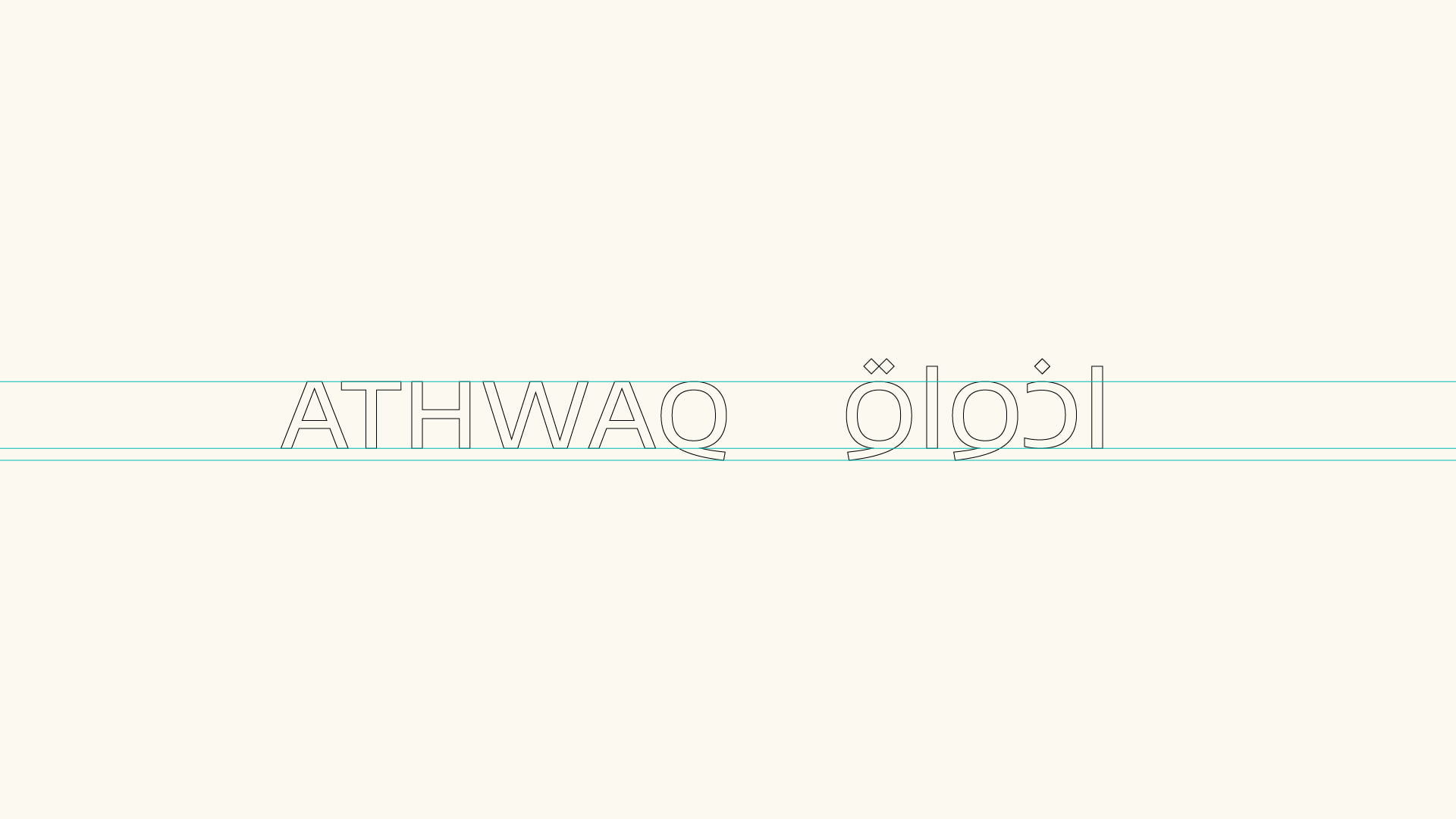
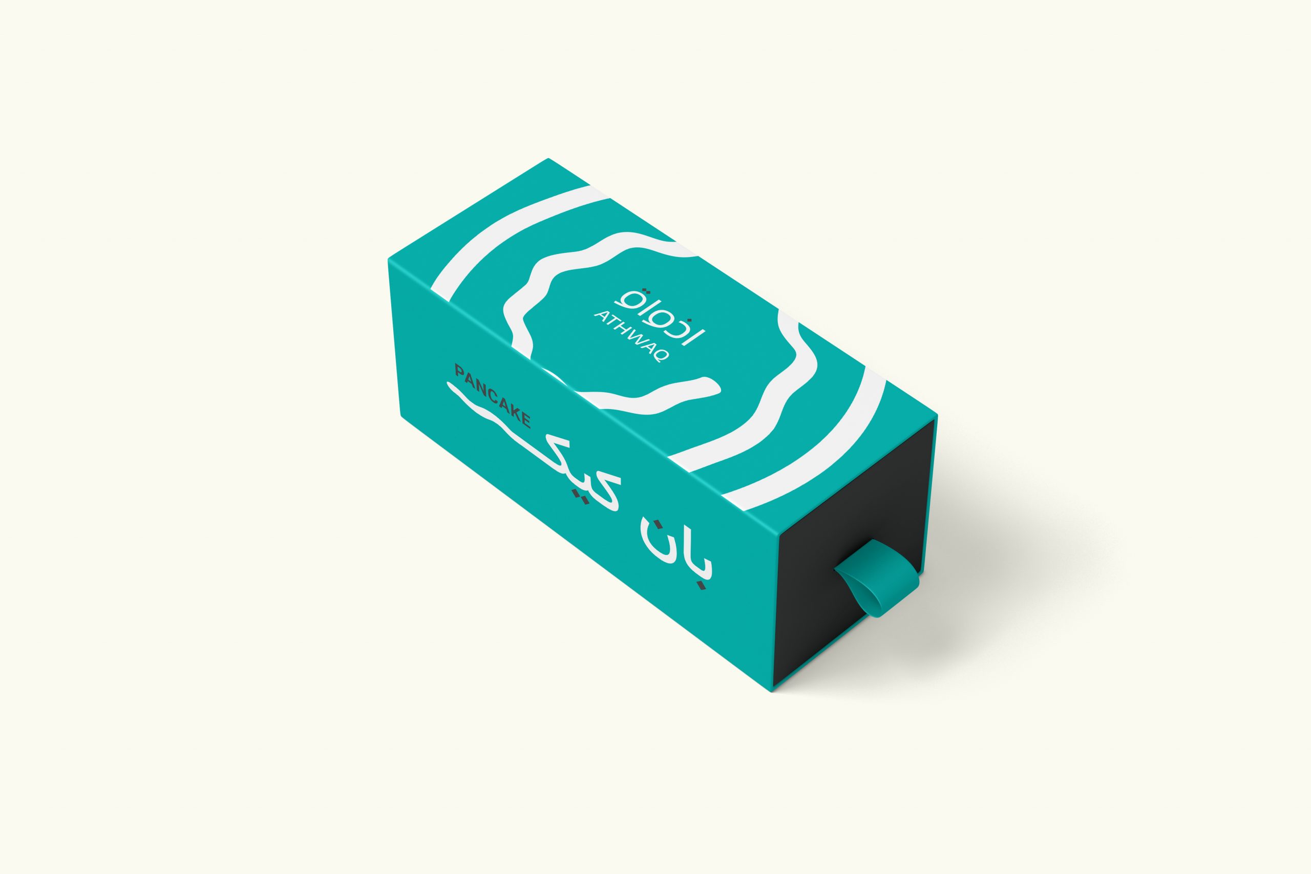
Athwaq Spiral is a unique typography artdirection that embodies the spirit of the Athwaq brand, Its innovative design features flowing lines and captivating curves, creating a visual representation of the brand's dynamic energy.
This artdirection serves as a powerful tool for communication, effectively conveying the brand's commitment to progress and innovation, it is a symbol of the brand's identity and a testament to its unwavering pursuit of excellence.
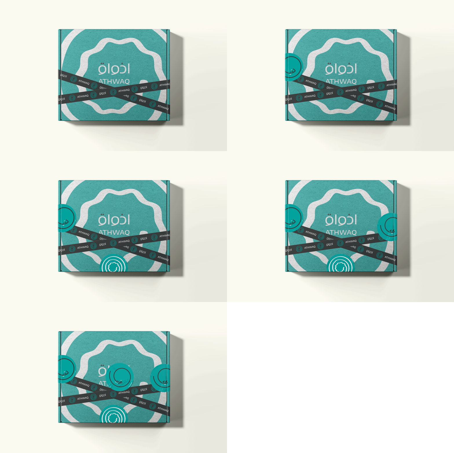
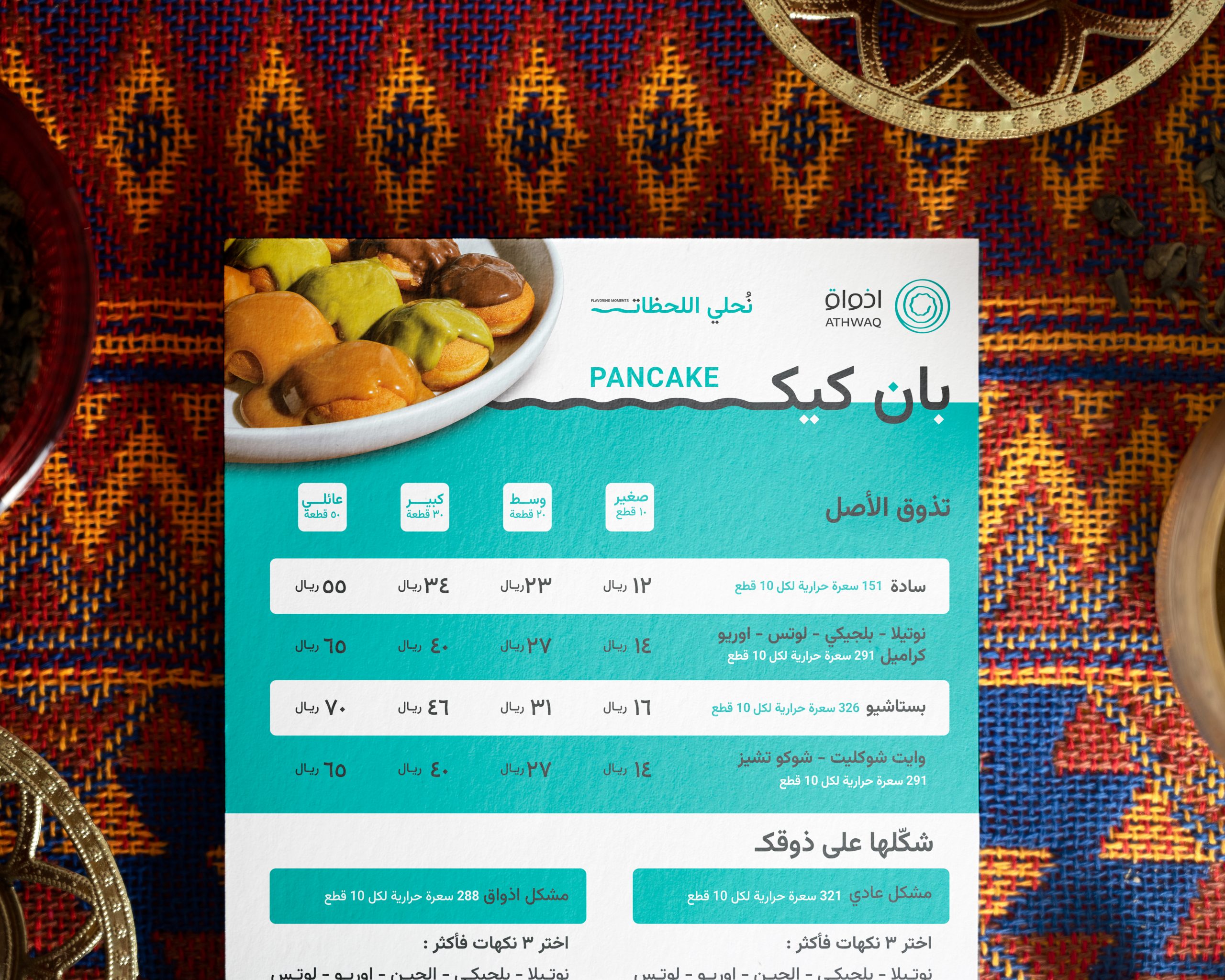
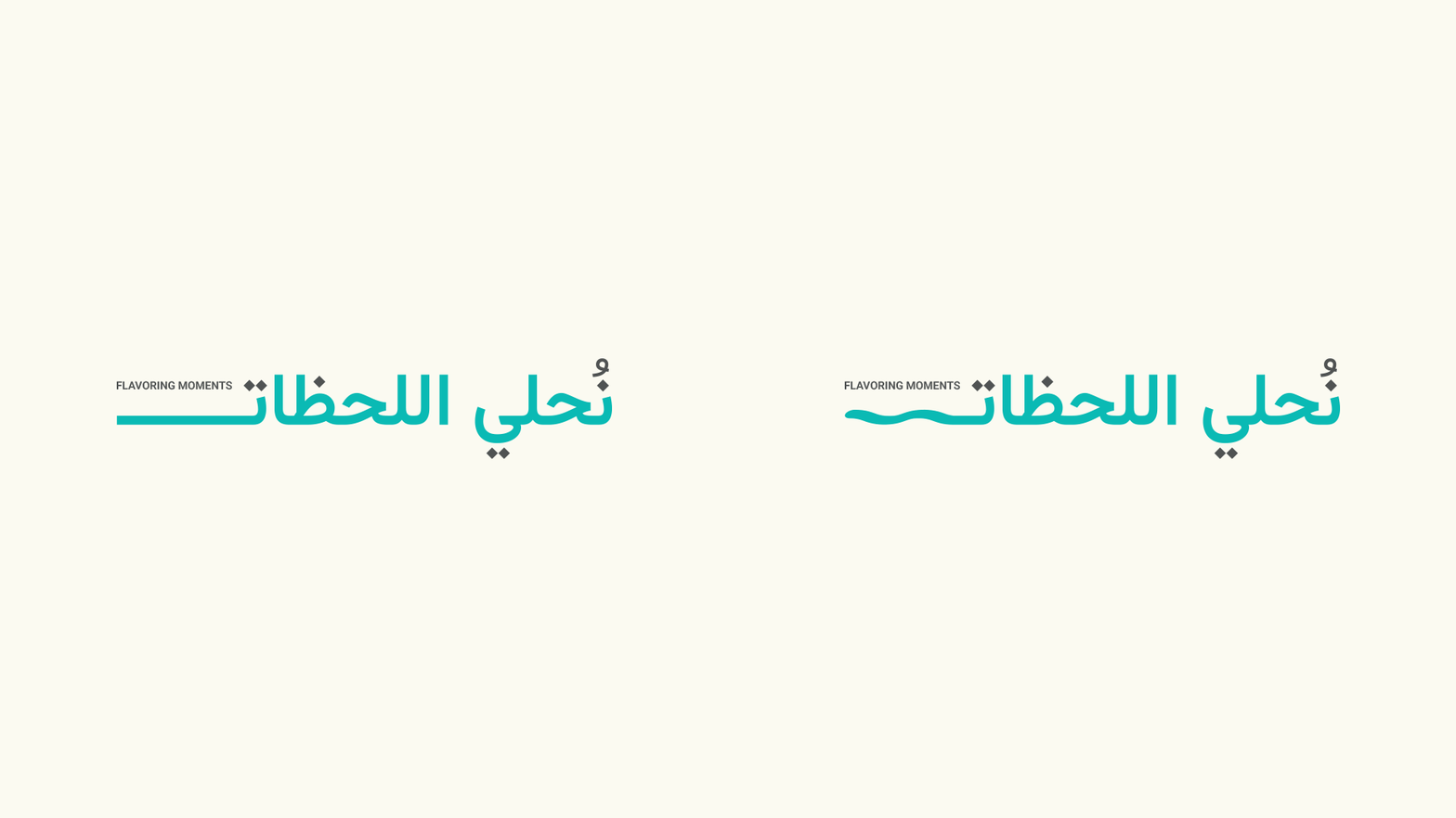
2nd Art direction | Arabic Kashidah
Athwaq Kashidah draws inspiration from the logo’s fluidity and elegance, enhancing Arabic typography with a unique flourish, we use it mainly with headlines and the tagline.
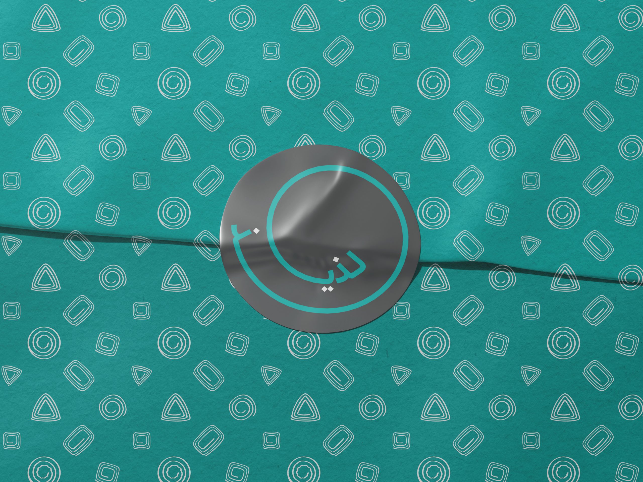
Brand Pattern
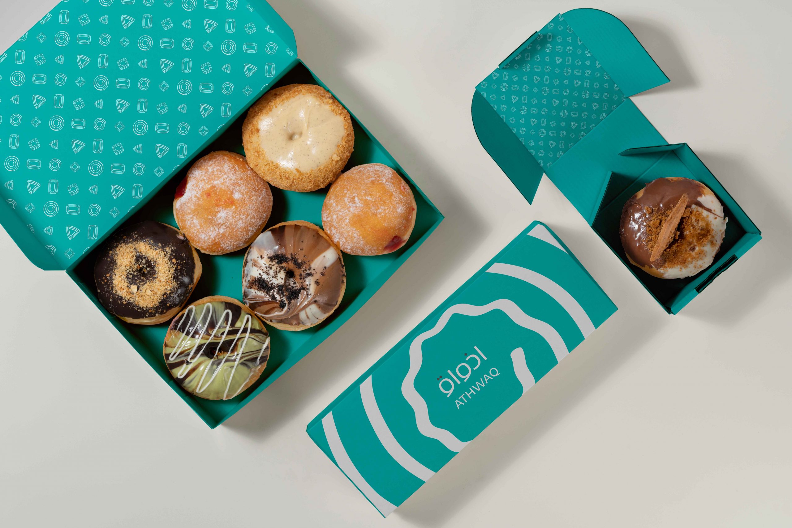
To capture the essence of Athwaq's global aspirations, we developed a unique visual pattern. This pattern cleverly integrates the fundamental shapes found in all sweets – squares of brownies, rectangular chocolate bars, perfectly round cookies, and playful triangles of baklava.

Basic Elements
Our art direction dances with circles, inspired by Athwaq's logo. Perfect circles represent timeless Western sweets, while circles with softer angles nod to Balah-Elsham and Eastern treats. Sharper angles and rich browns come into play for the world of chocolate.

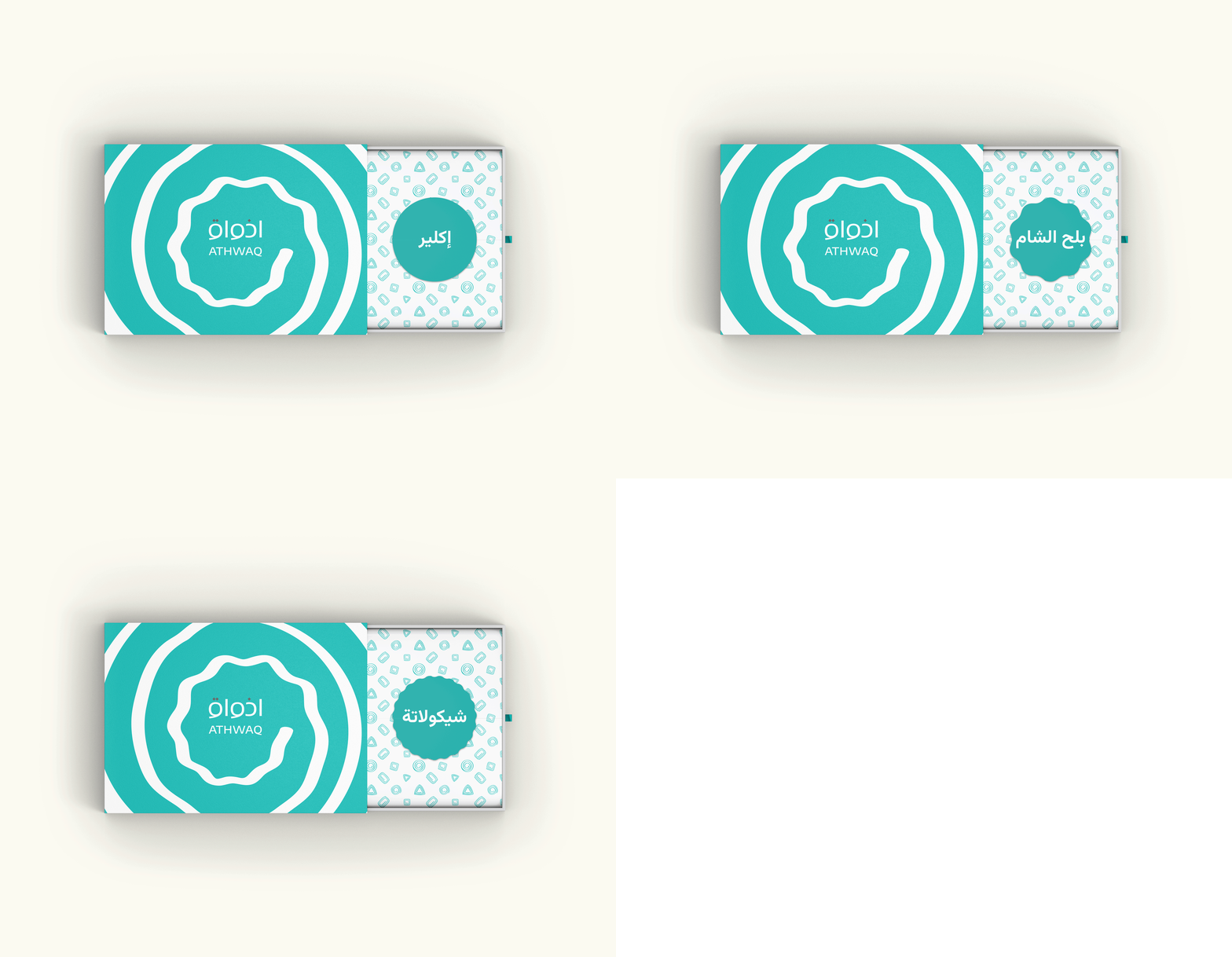
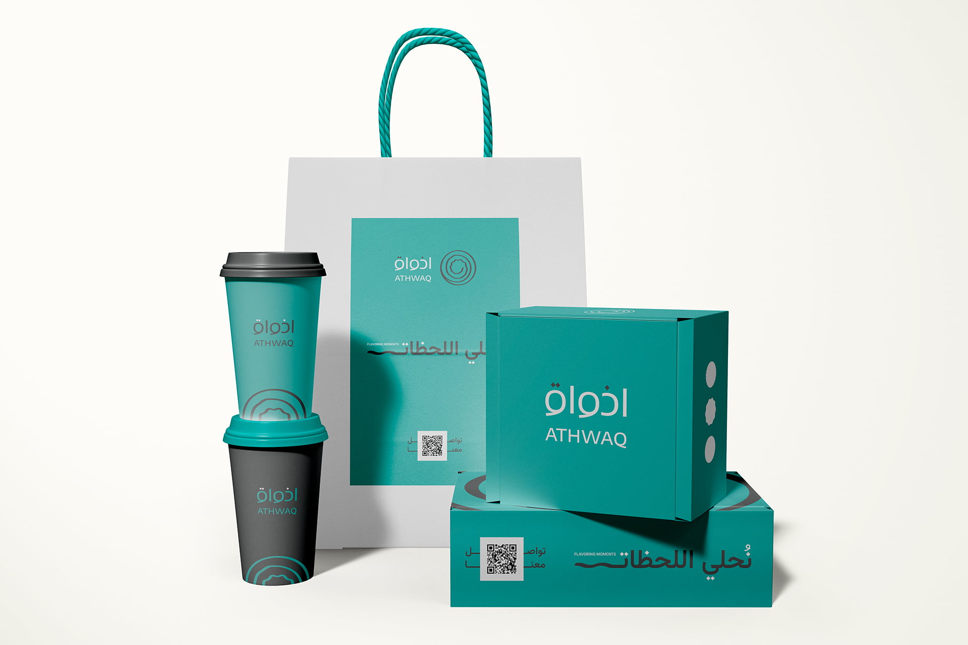
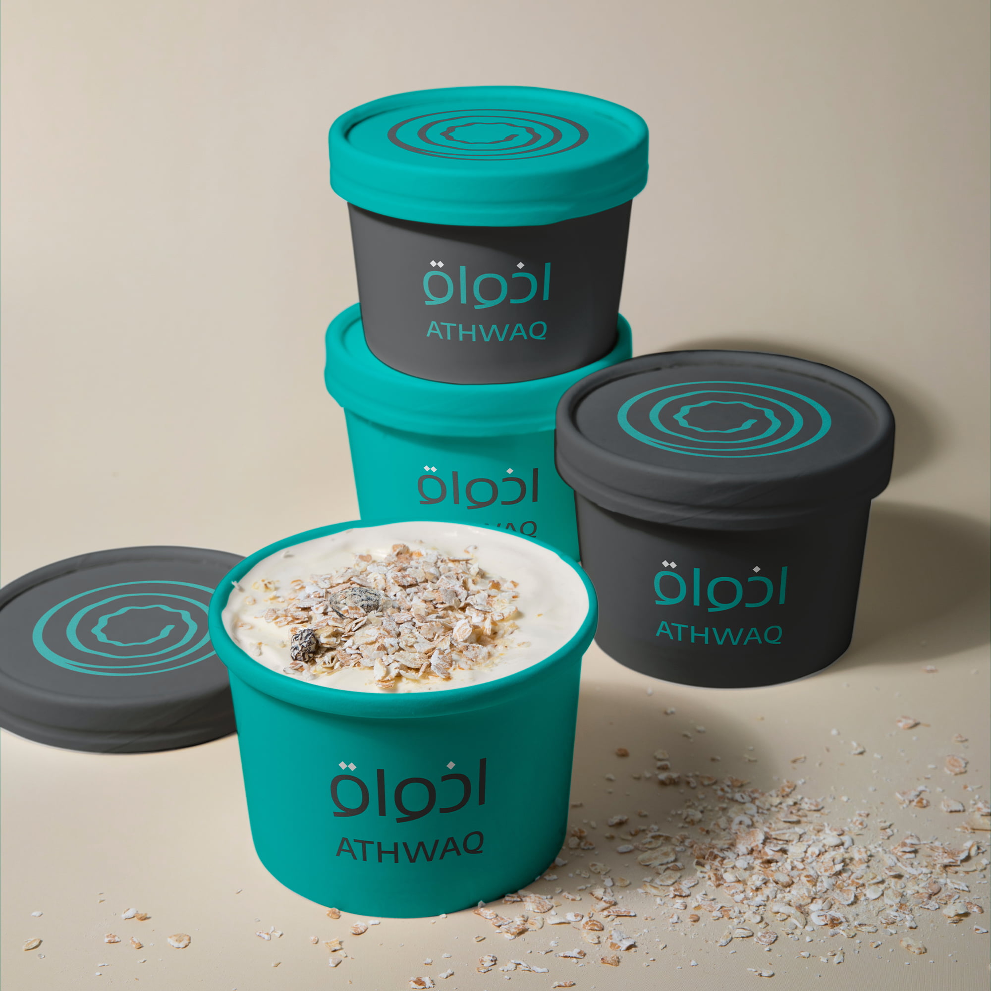
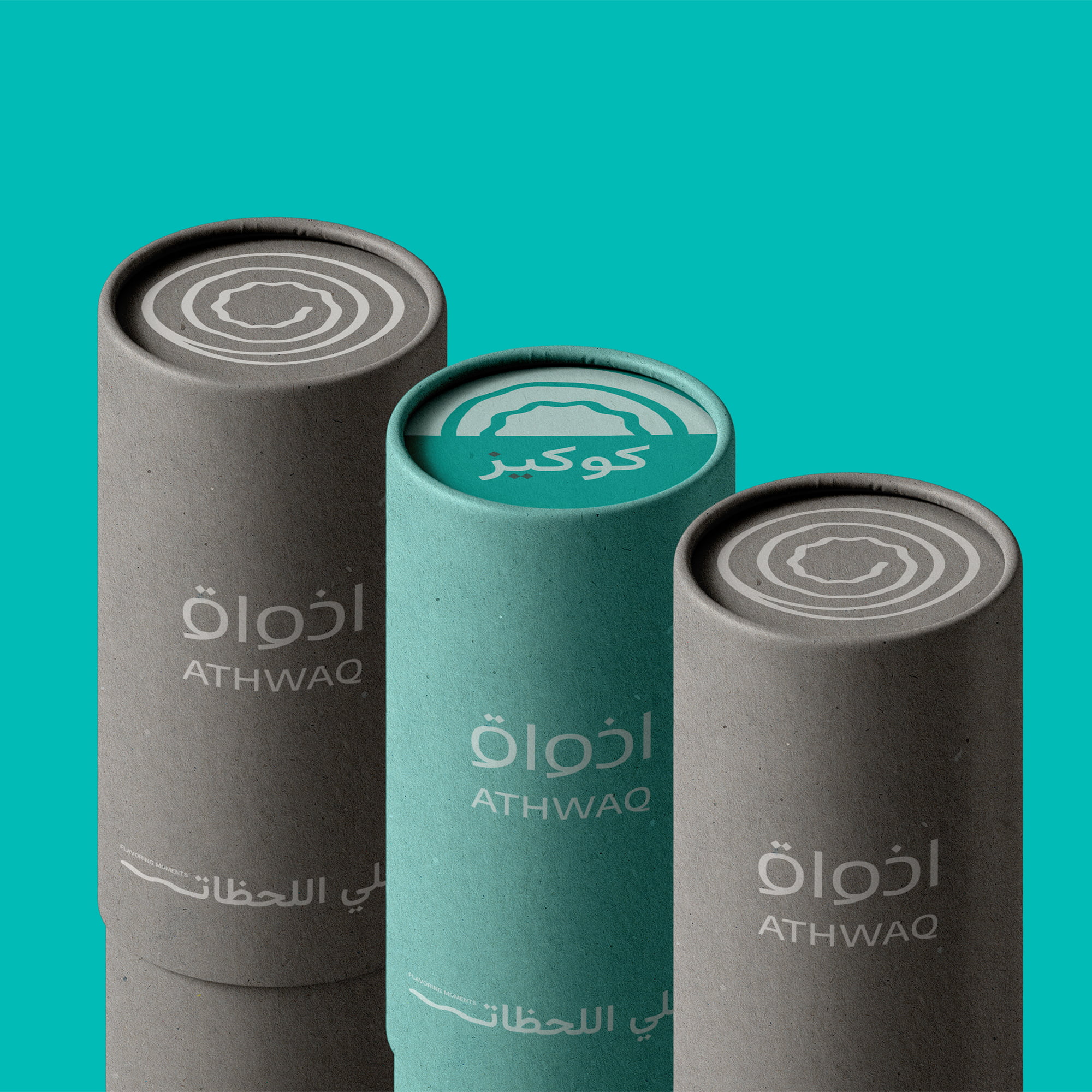
Athwaq's visual identity is a harmonious blend of strategic, flexible, and essential elements. It aims to be a global symbol of kindness, luxury, and simplicity, resonating with diverse audiences through compassion, elegance, and user-friendly design. The brand utilizes a rich visual language, incorporating patterns inspired by sweet shapes, basic geometric elements, and unique Arabic typography.
Selected Works

KimCam AcademyEducation
Kepler Cultural CafeFood & Beverages

Just HawawshiFood & Beverages

EMLE NotesEducation

One & AllRetail

AthwaqPastry
River EyeCareMedical