
Brand Overview
A culinary fusion concept that reimagines the classic hawawshi recipe by blending diverse cultural influences and high-quality local ingredients
By using locally sourced, high-quality ingredients, Just Hawawshi maintains the essence of the classic dish while introducing new and surprising flavors.
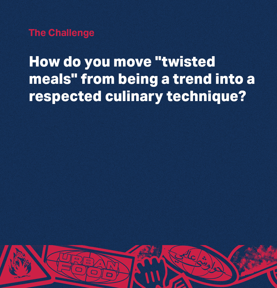
The Challenge
The main challenge faced by Just Hawawshi is effectively communicating its unique concept of "mixing cultures" to customers without causing confusion.

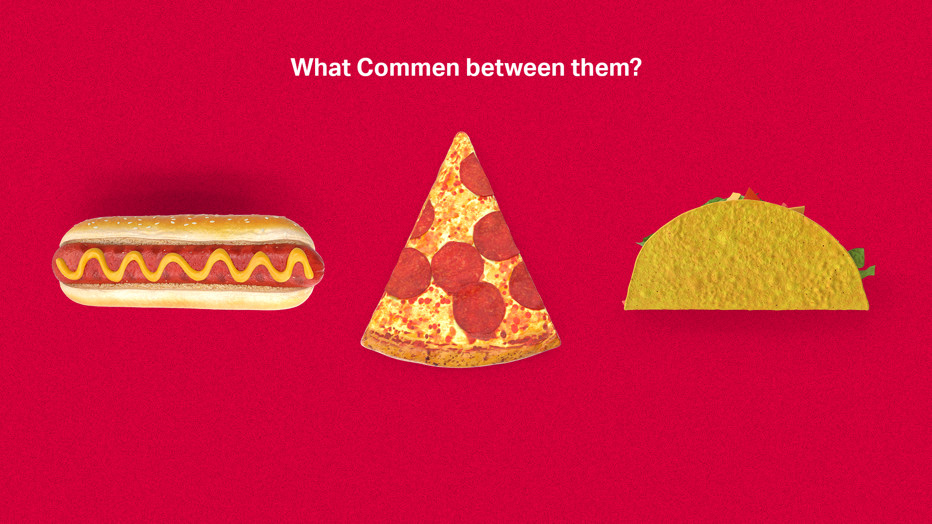
Gathering NOT mixing dishes:
Instead of mixing, which appears as putting things different to each other together, we gather by focusing on the similarities between things.

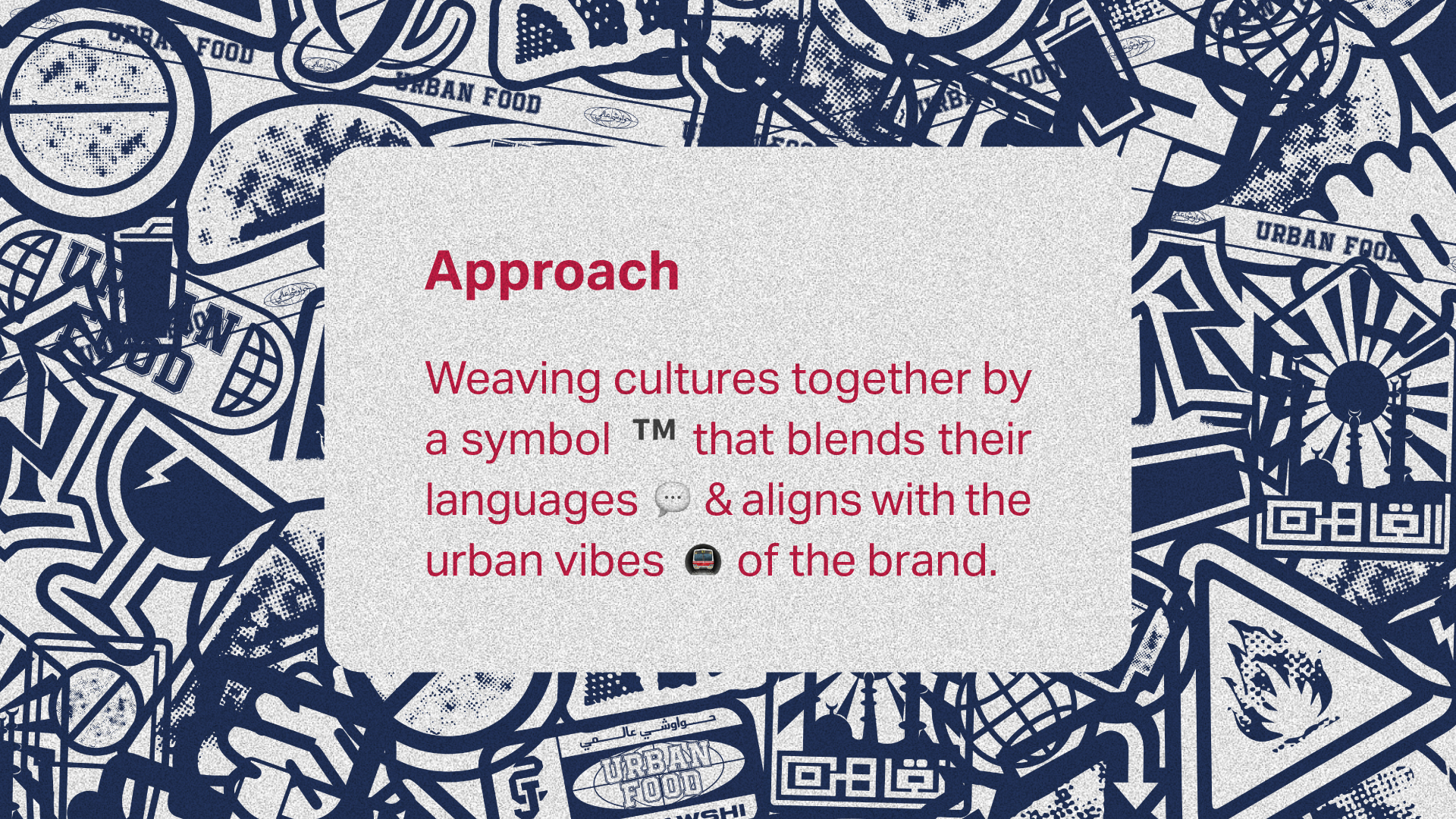
Positioning Theme
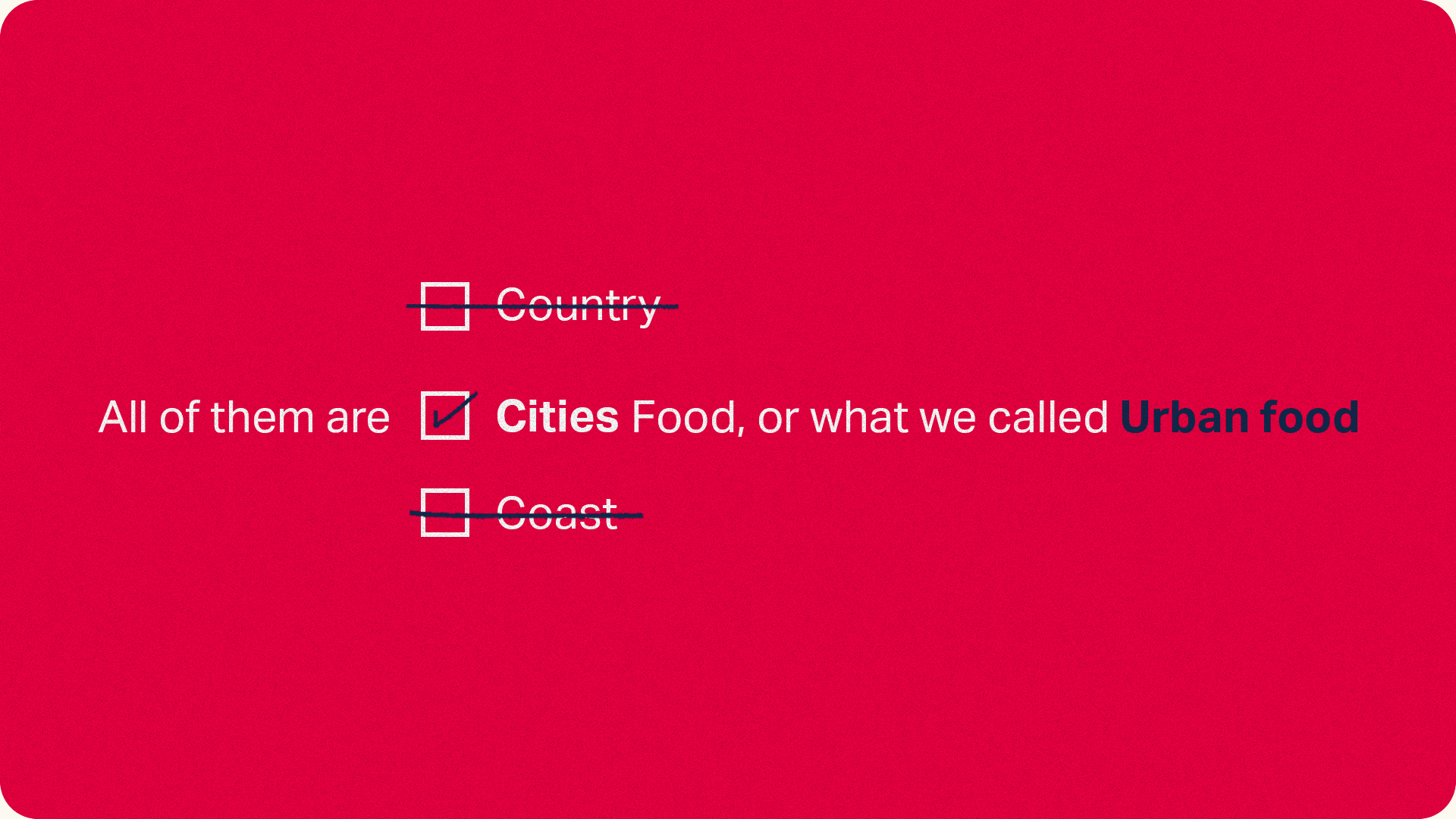
Urban food refers to the type of cuisine that is typically associated with large cities and urban areas. It often reflects the diverse cultural influences and global trends that can be found in cities
around the world.
Urban food is often characterized by its innovative, fusion-inspired dishes, creative presentation, and use of high-quality, locally sourced ingredients.
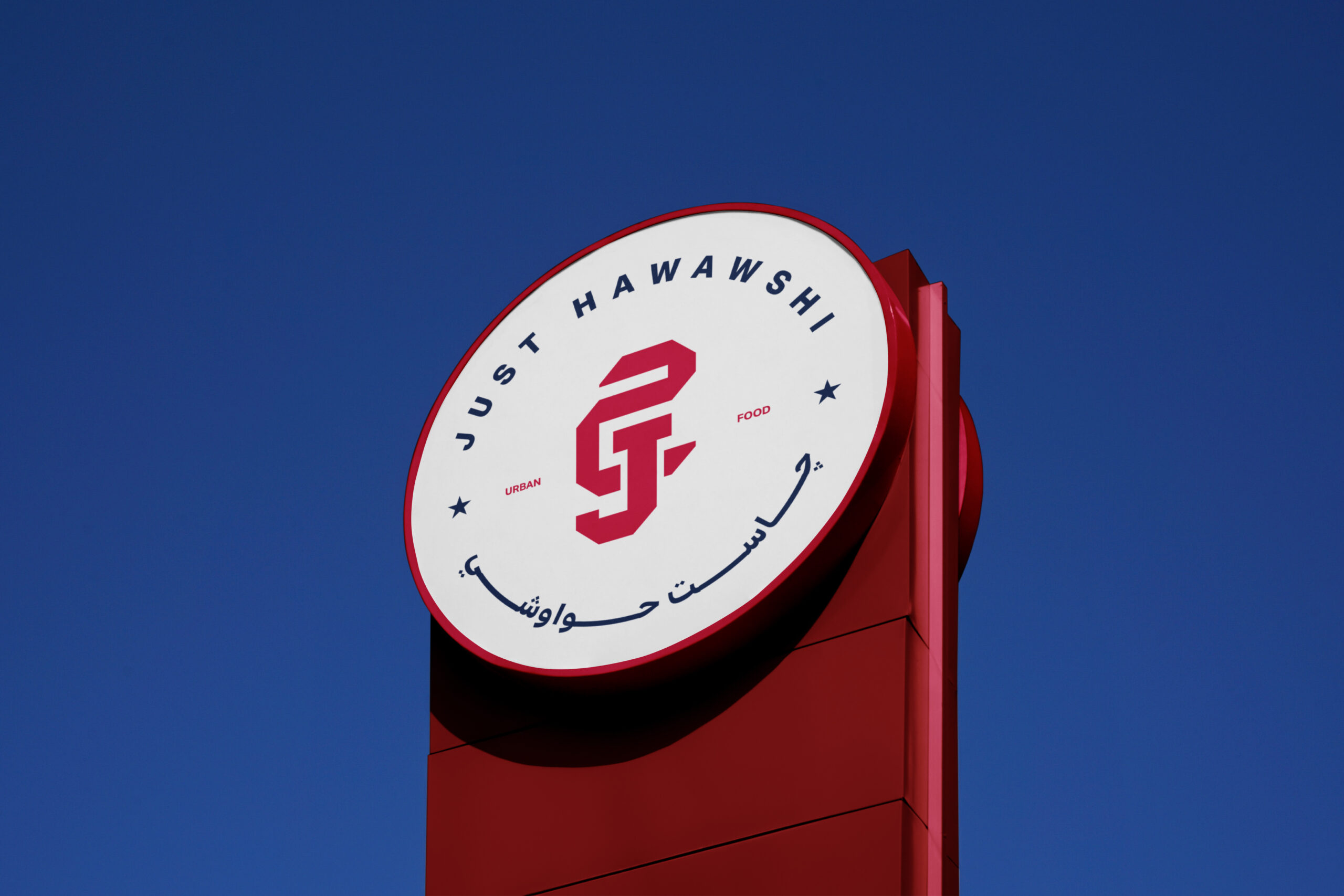
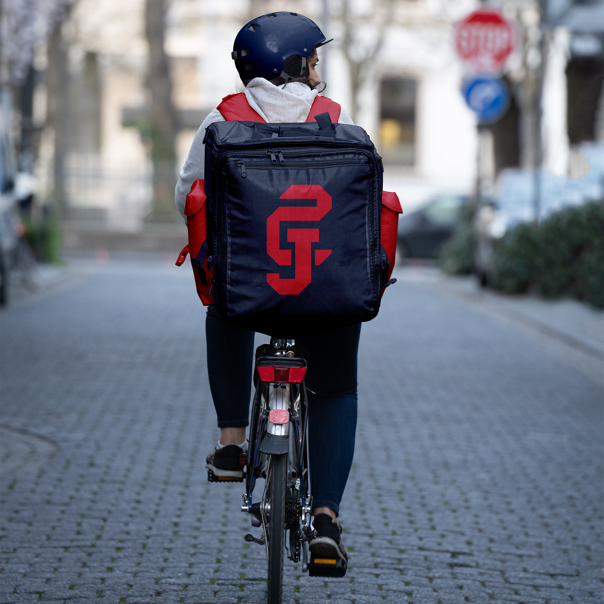
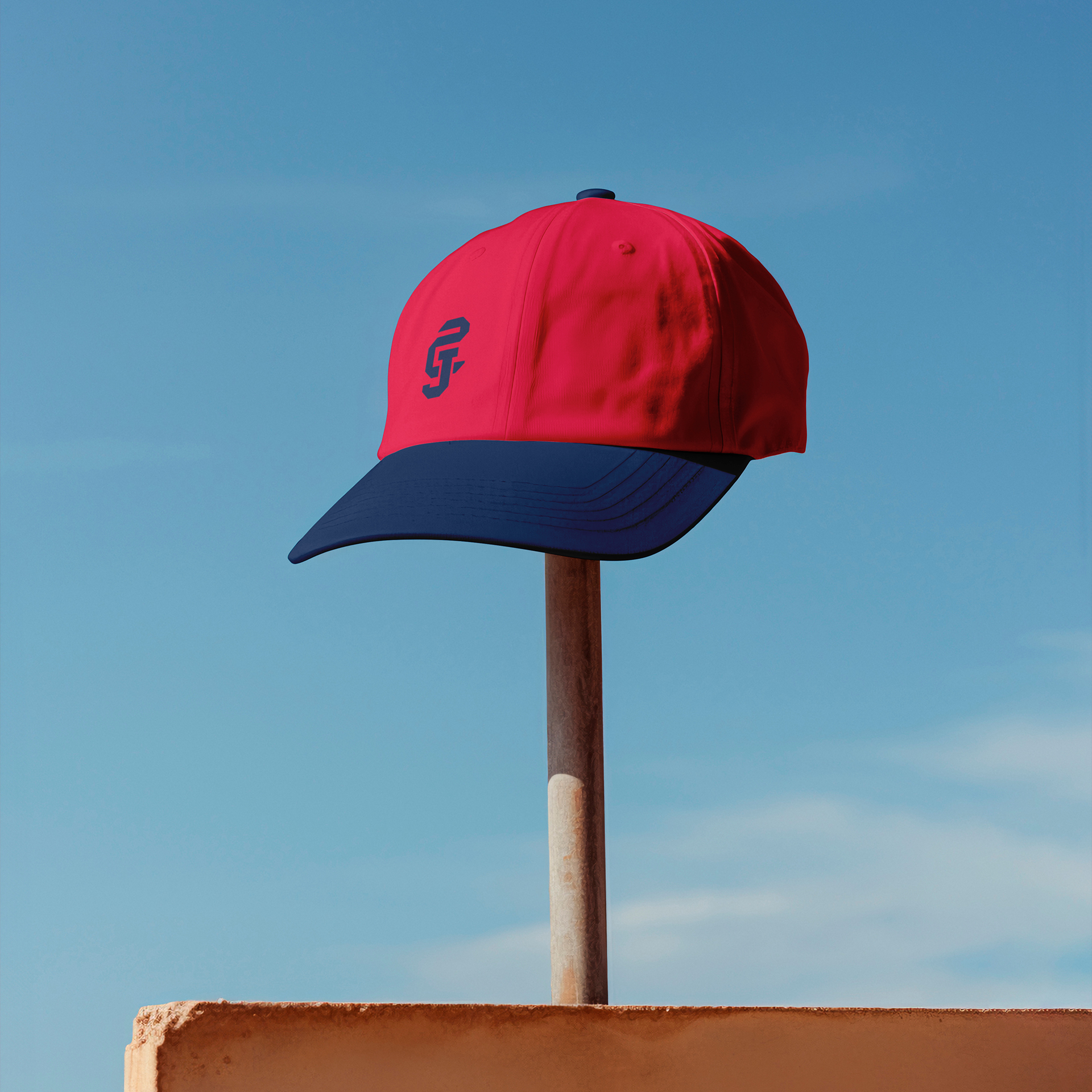
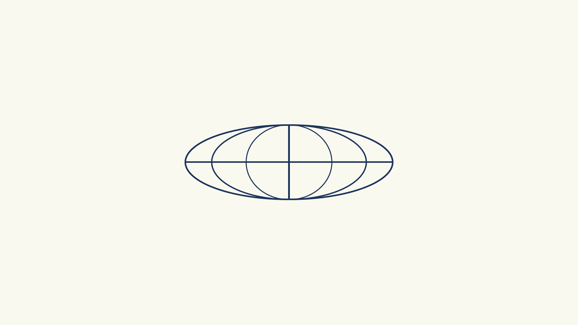
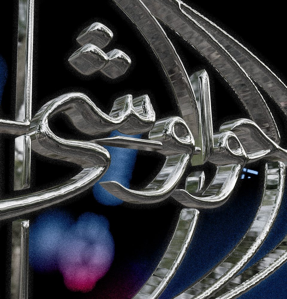
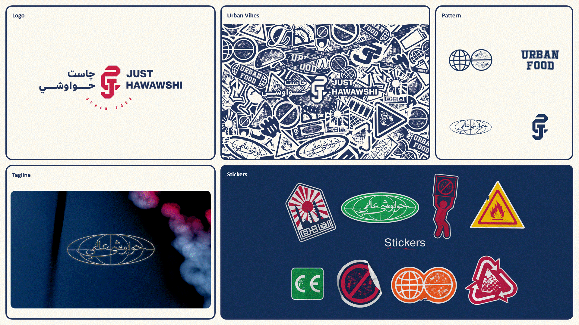
Mark Concept
The dynamic and diverse appearance of the logo, with its combination of the J and ح letters in different styles and colors, gives it a practical and flexible quality that can adapt to various contexts and applications. At the same time, the unique and recognizable combination of the two letters makes the logo iconic and memorable, helping to build a strong brand identity for the restaurant.
Overall, this approach to the logo design achieves a balance between practicality and distinctiveness, making it both dynamic and iconic.

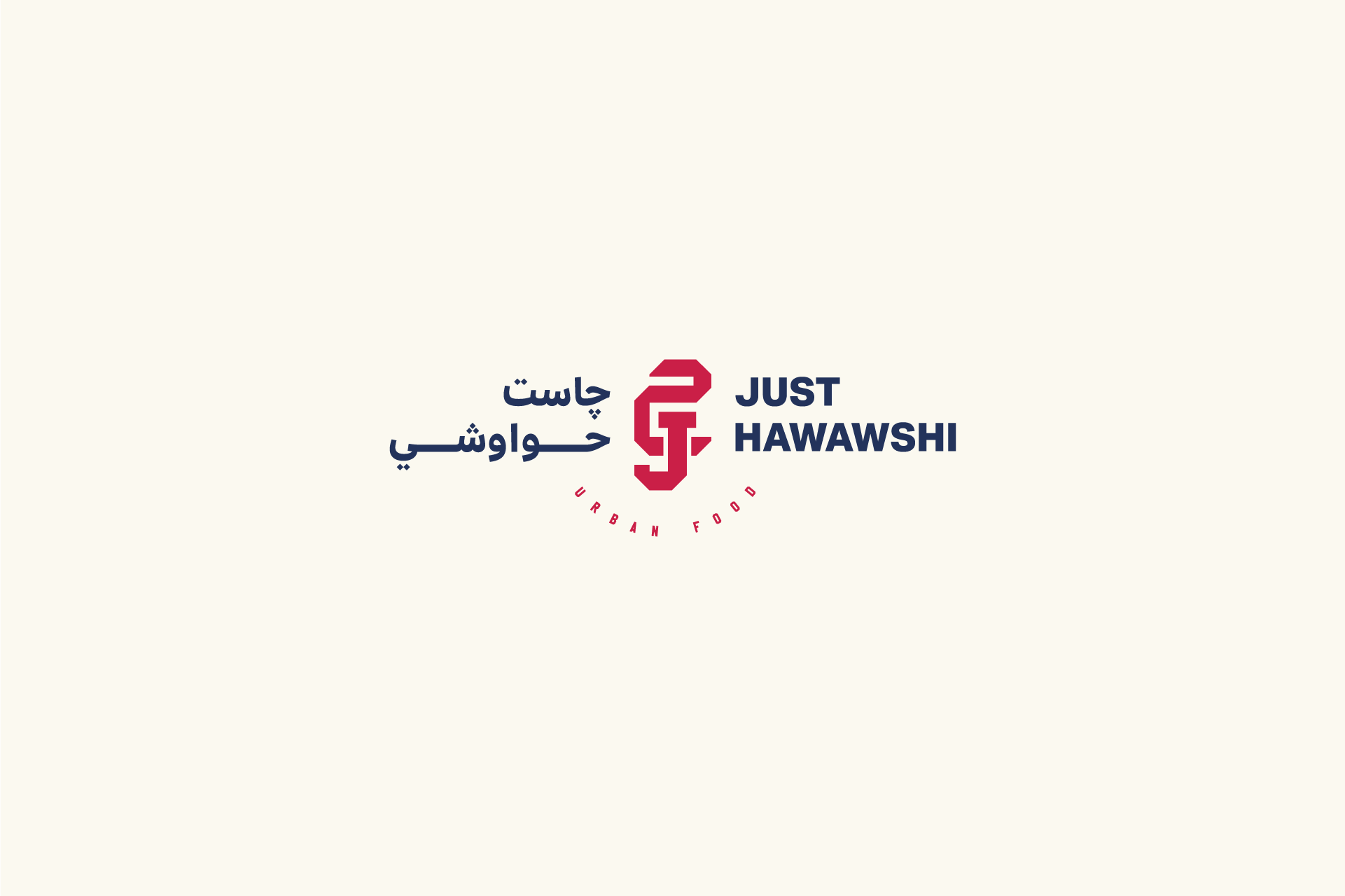
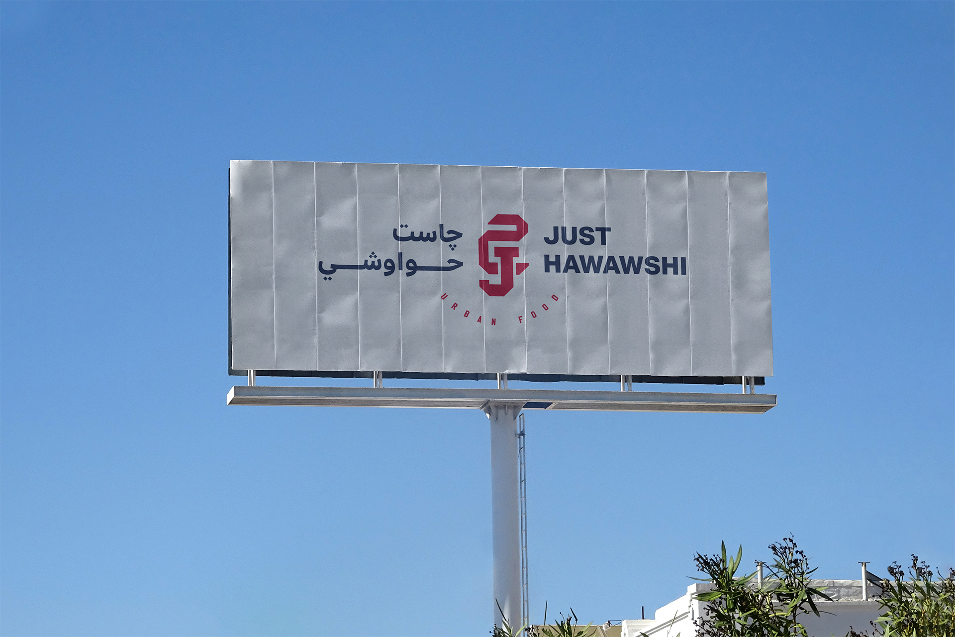


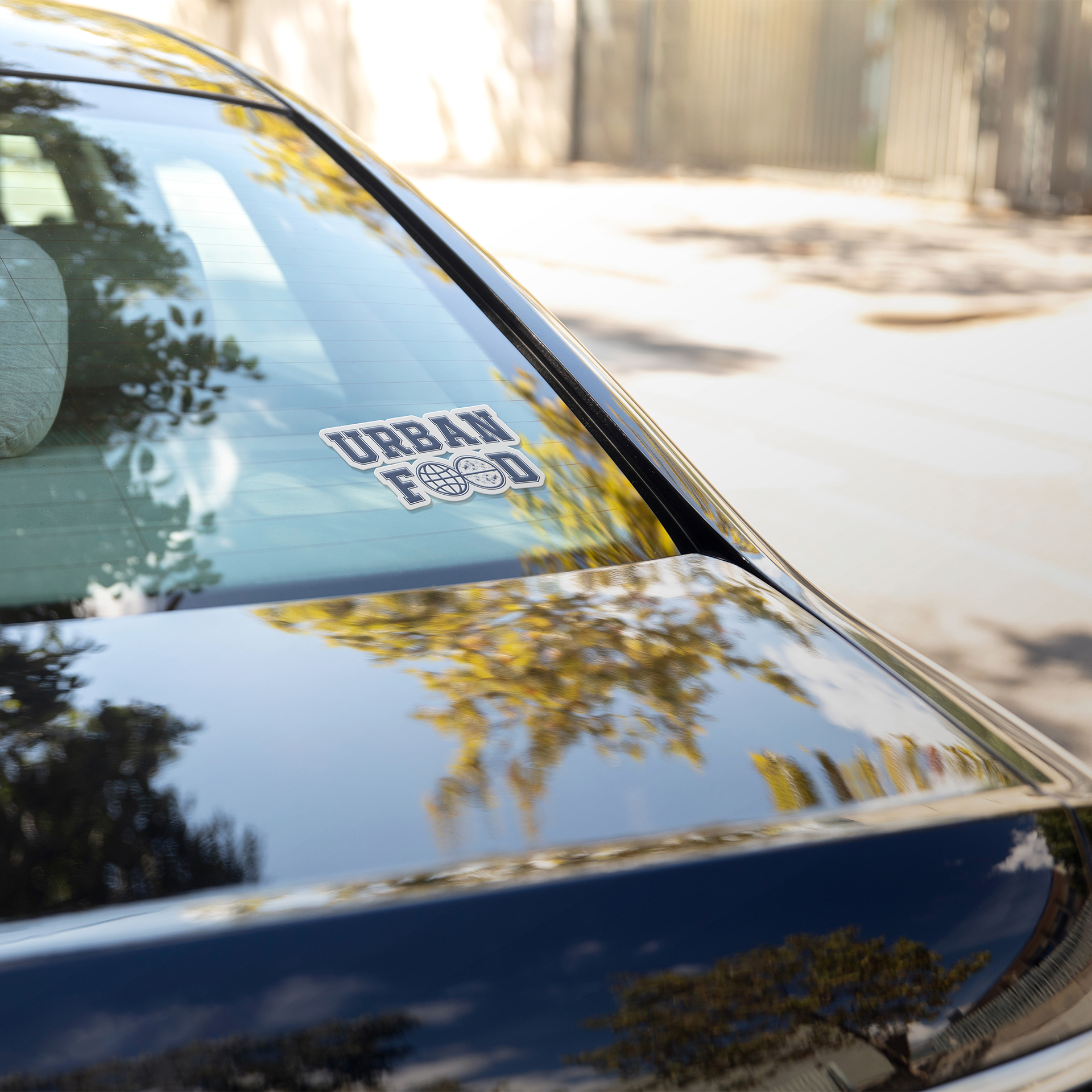
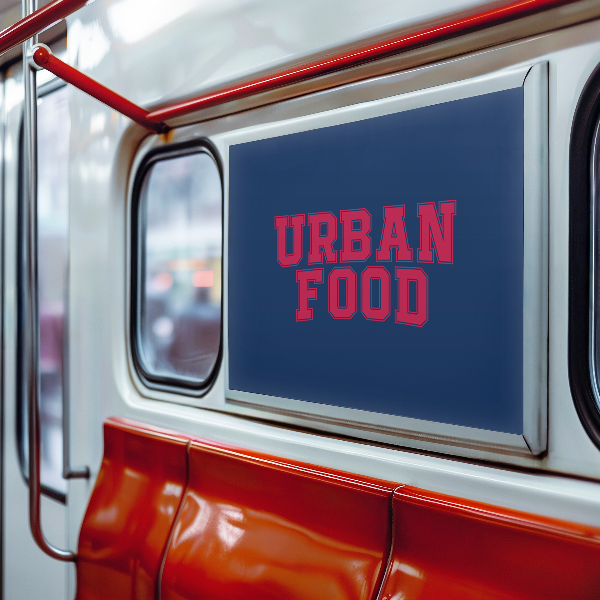
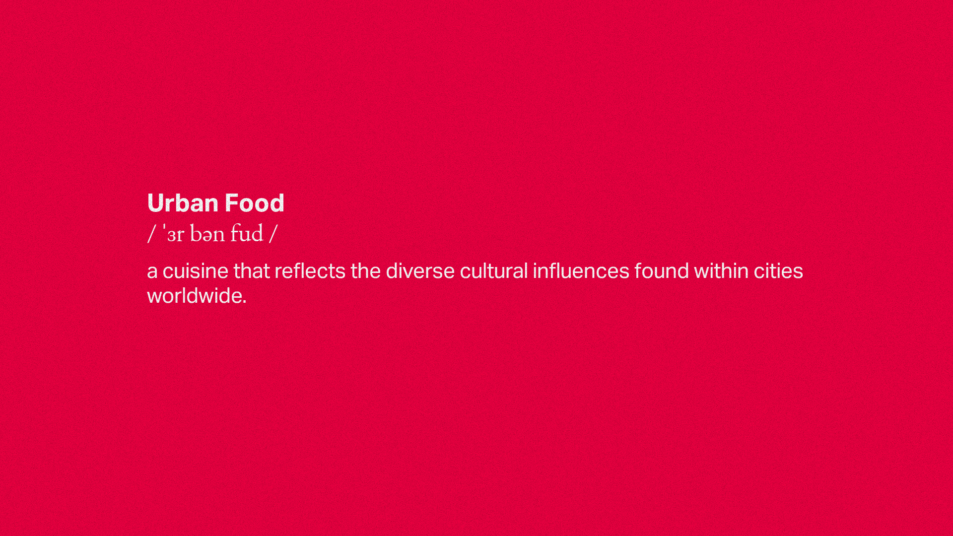
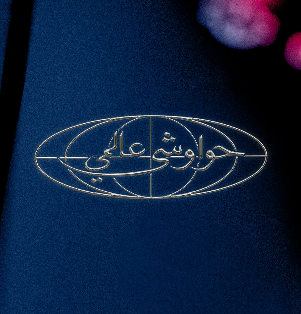
Tagline
The tagline for Just Hawawshi, "Urban Food," captures the essence of the brand's culinary philosophy. It speaks to the restaurant's location within the dynamic urban environment, a place where diverse cultures and flavors converge. But "Urban Food" goes beyond mere location. It signifies a forward-thinking approach to cuisine, where tradition is reimagined through the lens of global influences.
This concept translates beautifully into Arabic as "حواوشي عالمي". This tagline retains the core message of "Urban Food" while adding a layer of cultural connection.
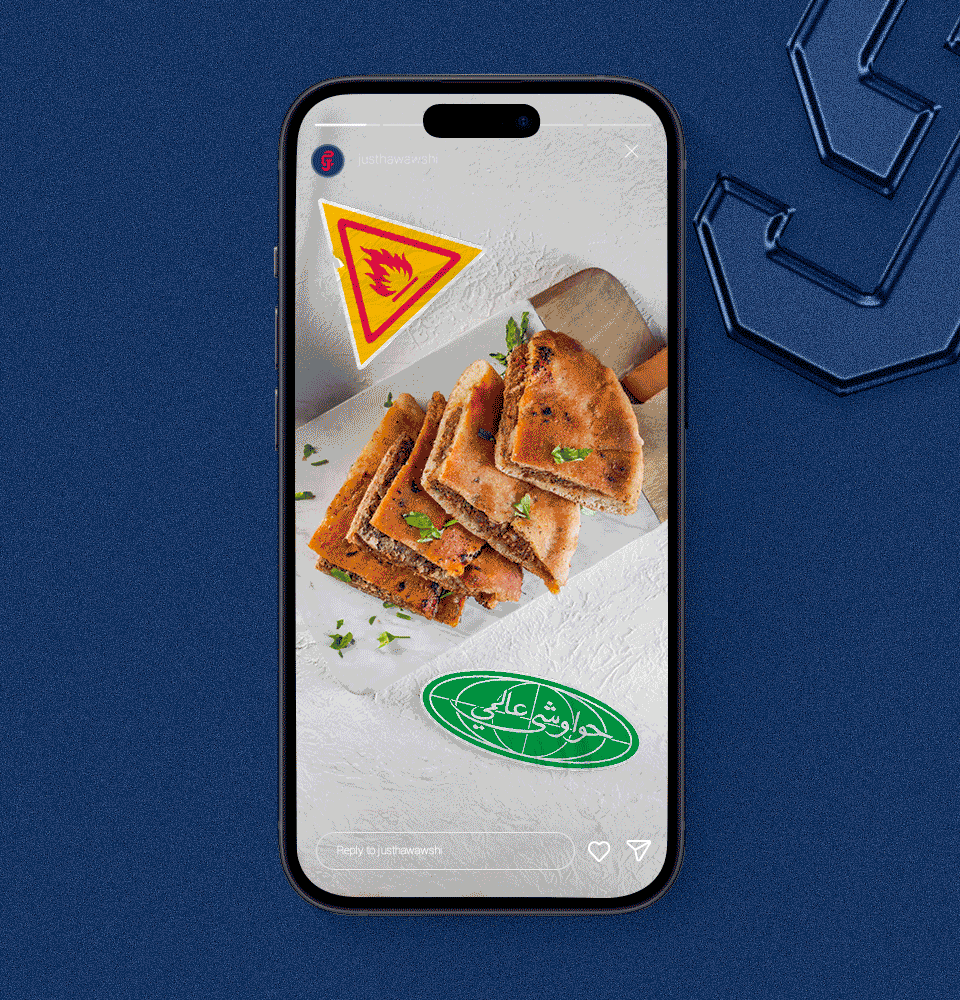
Urban Vibes
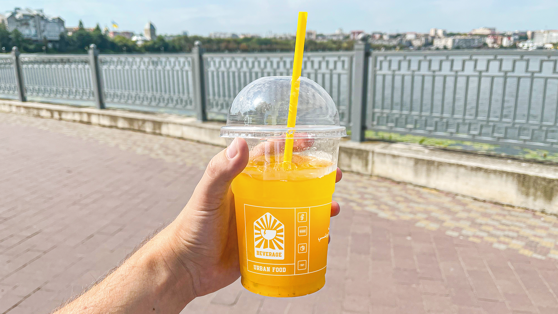
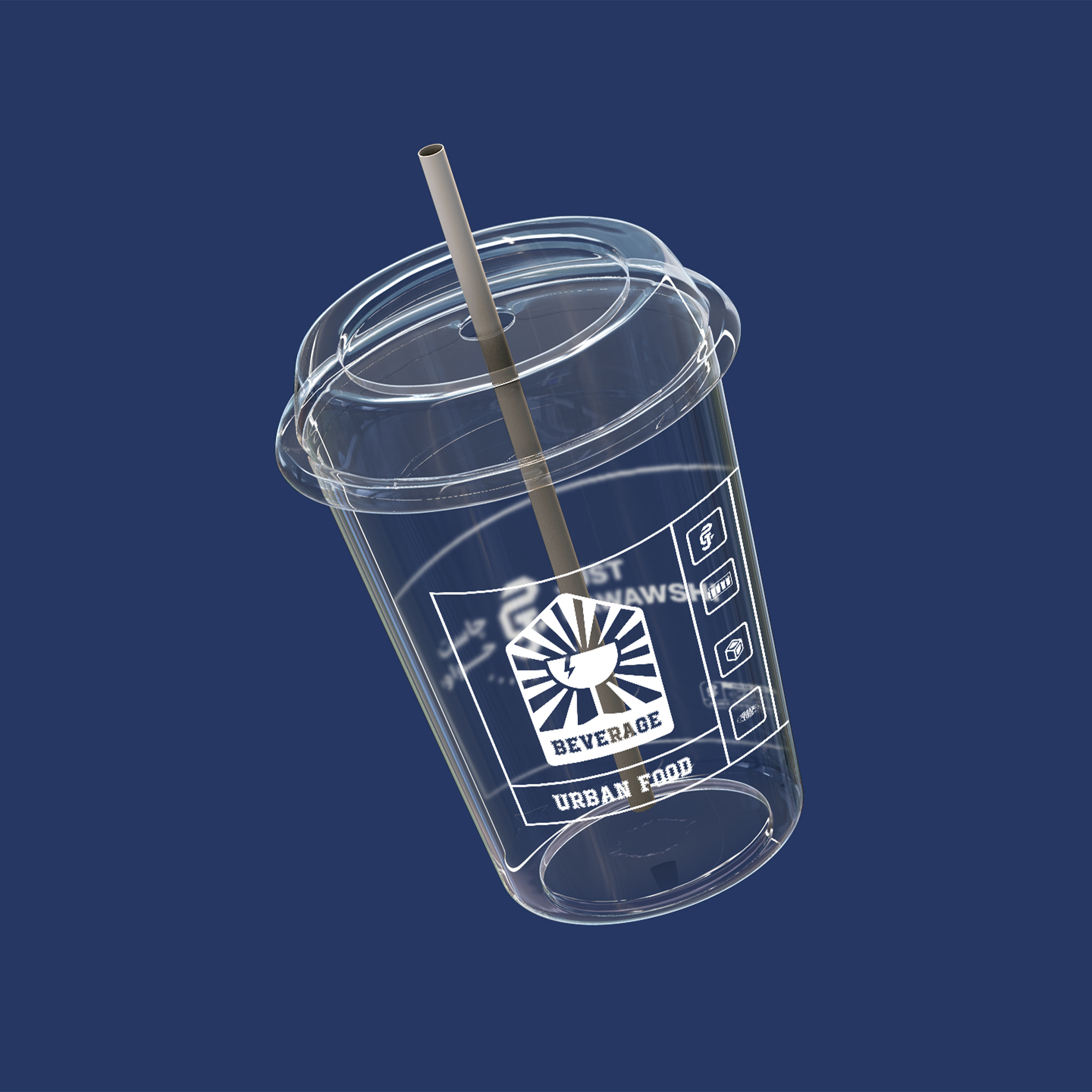
We use pictograms in our icon system to creatively express urban vibes and showcase the boldness and globalization of our brand. These standard icons with a modern twist signify our commitment to global flavors and reflect the dynamic energy of urban life.
This essential visual language enhances our brand identity and resonates with a diverse audience, transcending language barriers and cultural differences.


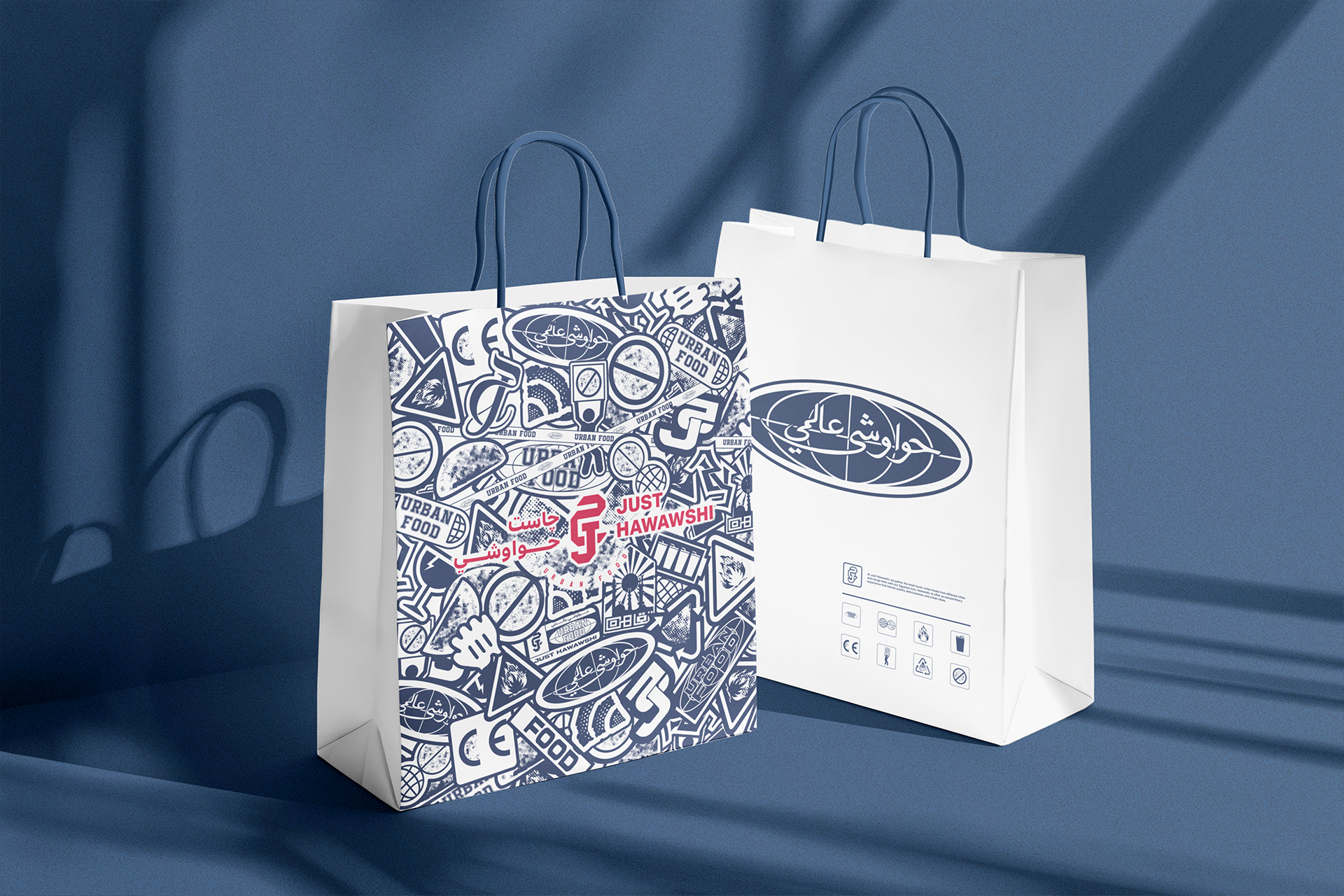
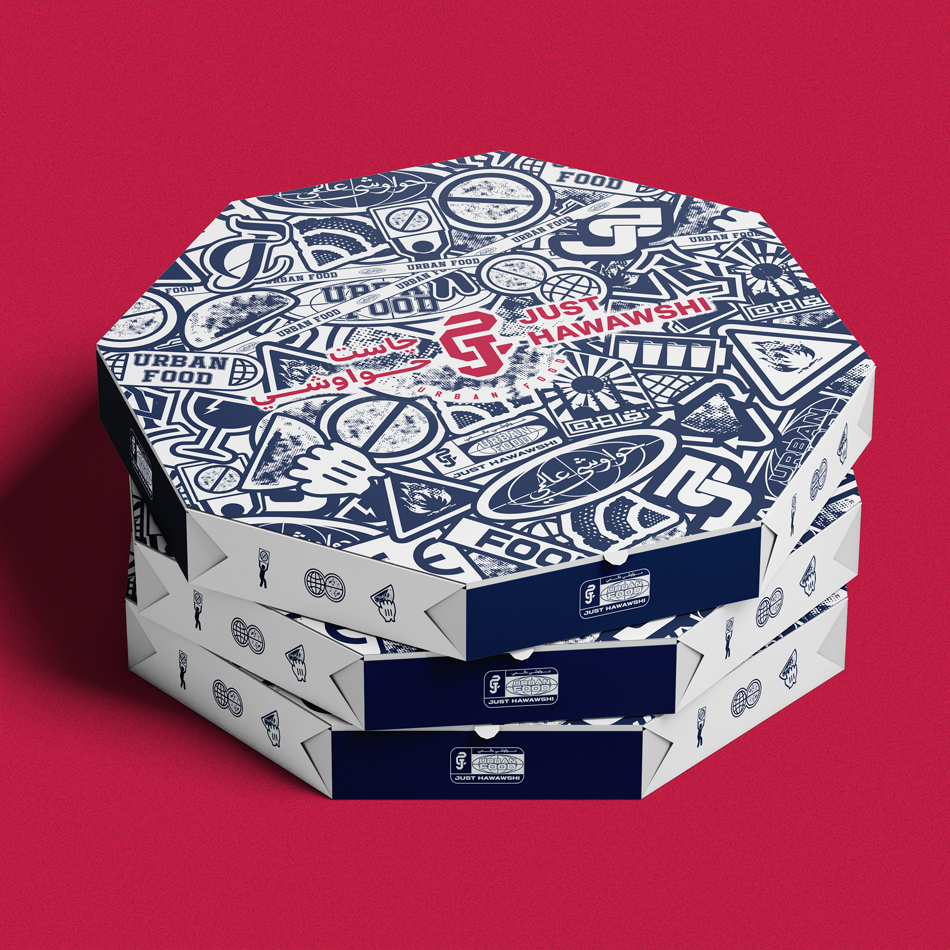
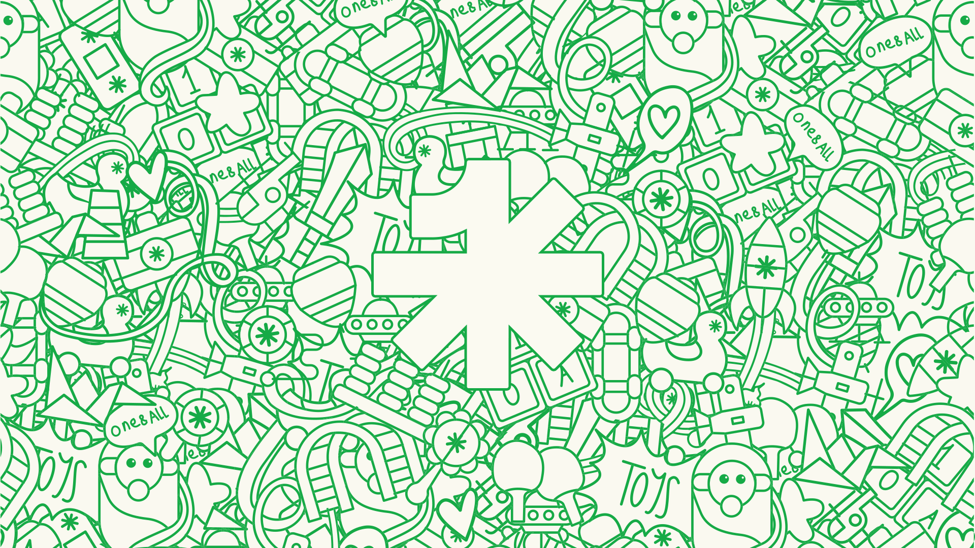
Brand Packing
Package design takes a creative approach, using stickers, icons, logo, and brand name in a random arrangement and repetition to create a crowded and appealing appearance. This design mirrors the bustling urban vibes of our restaurant, capturing the energy and excitement of the experience.
The rich array of details showcases the diverse fusion of flavors in our menu, creating a visual storytelling canvas. The design invites customers to explore a varied culinary journey and evokes curiosity and excitement. It represents our brand as an urban hotspot where discovery meets a fusion of tastes, leaving a lasting impression on our customers.

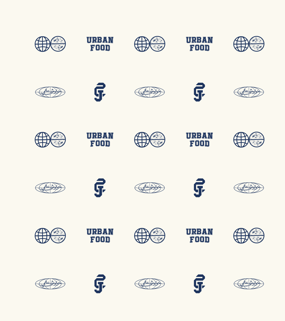
Brand Pattern
We drew inspiration for the brand’s pattern from the most iconic urban assets, such as letters, the globe icon, and our tagline. The pattern features a combination of these elements that represents the urban energy and diversity.
The letters add a personalized touch, signifying the uniqueness of our offerings. The globe icon symbolizes our global approach to food, incorporating flavors from various cultures.
Finally, the tagline ties it all together, emphasizing our commitment to providing a modern and vibrant dining experience. This pattern showcases the essence of our brand and creates a cohesive and memorable visual identity.

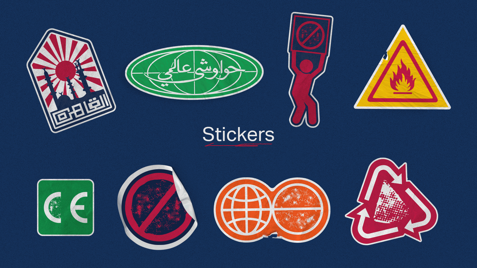
Urban mojis
We incorporate stickers in various communication designs to add an element of playfulness and excitement to our brand. These stickers infuse our visuals with a touch of urban charm, reflecting the dynamic energy of our restaurant.
From menus to marketing materials, stickers create a memorable and interactive experience for our audience, inviting them to engage with our brand in a fun and relatable way. This use of stickers reinforces our commitment to a modern and vibrant approach, resonating with our urban-minded customers and leaving a lasting impression.
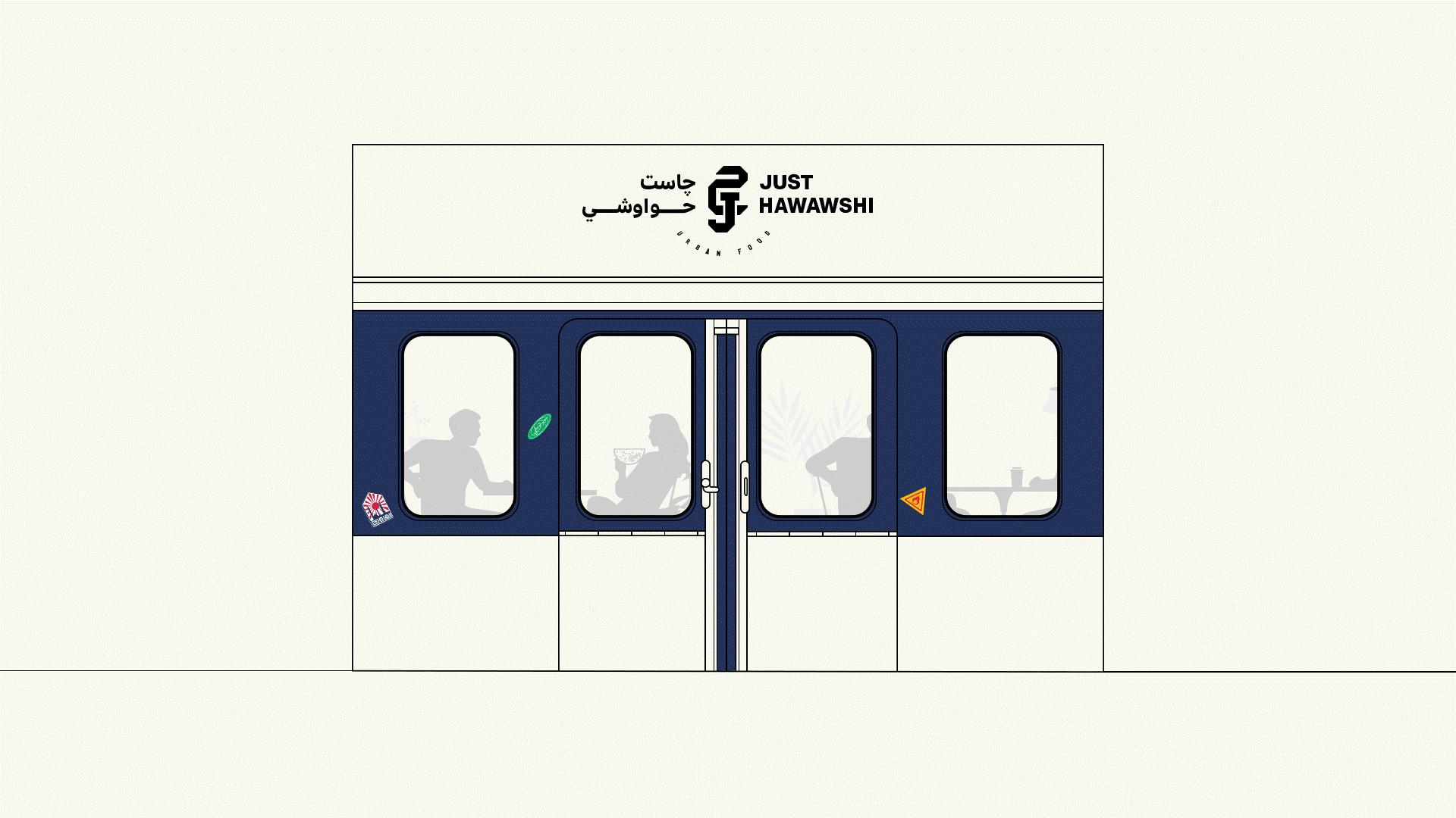
Metro Facade
The facade of Just Hawawshi takes inspiration from the iconic sliding doors of the urban metro system. More than just a functional element, these doors represent the constant movement, cultural exchange, and diverse experiences that define city life.
This inspiration translates into a dynamic facade that invites customers on a culinary journey. The large, segmented windows act as portals, offering glimpses into the vibrant energy and innovative culinary creations within. Similar to the metro doors opening to reveal different destinations, Just Hawawshi promises a unique exploration of flavors for every customer.
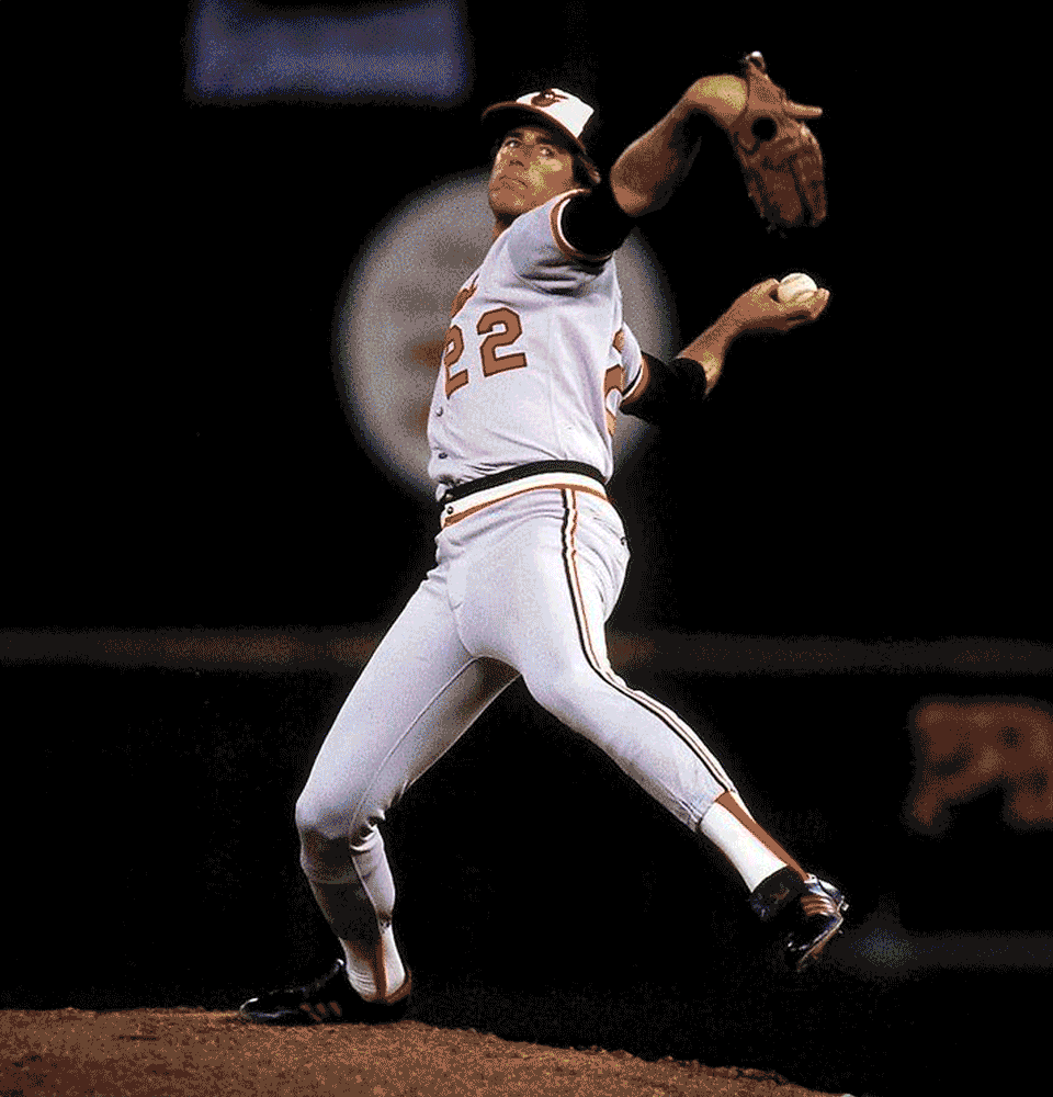
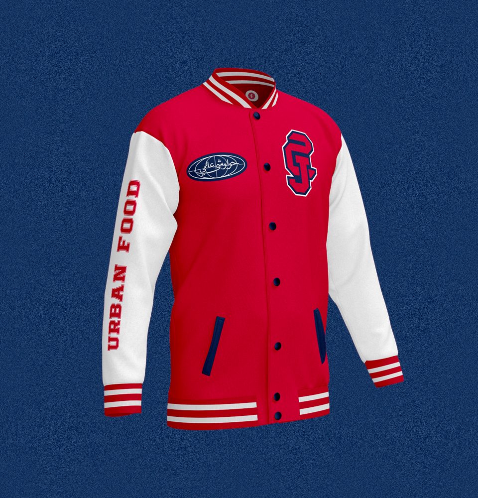
Uniform
The reason we use baseball jackets as uniforms in our restaurant is because baseball is deeply ingrained in metropolitan culture. This sport has become an iconic symbol of urban life, with baseball fields often found in city parks and communities.
By adopting baseball jackets as our uniform, we pay homage to this urban connection and tap into the nostalgic and energetic spirit associated with the sport.
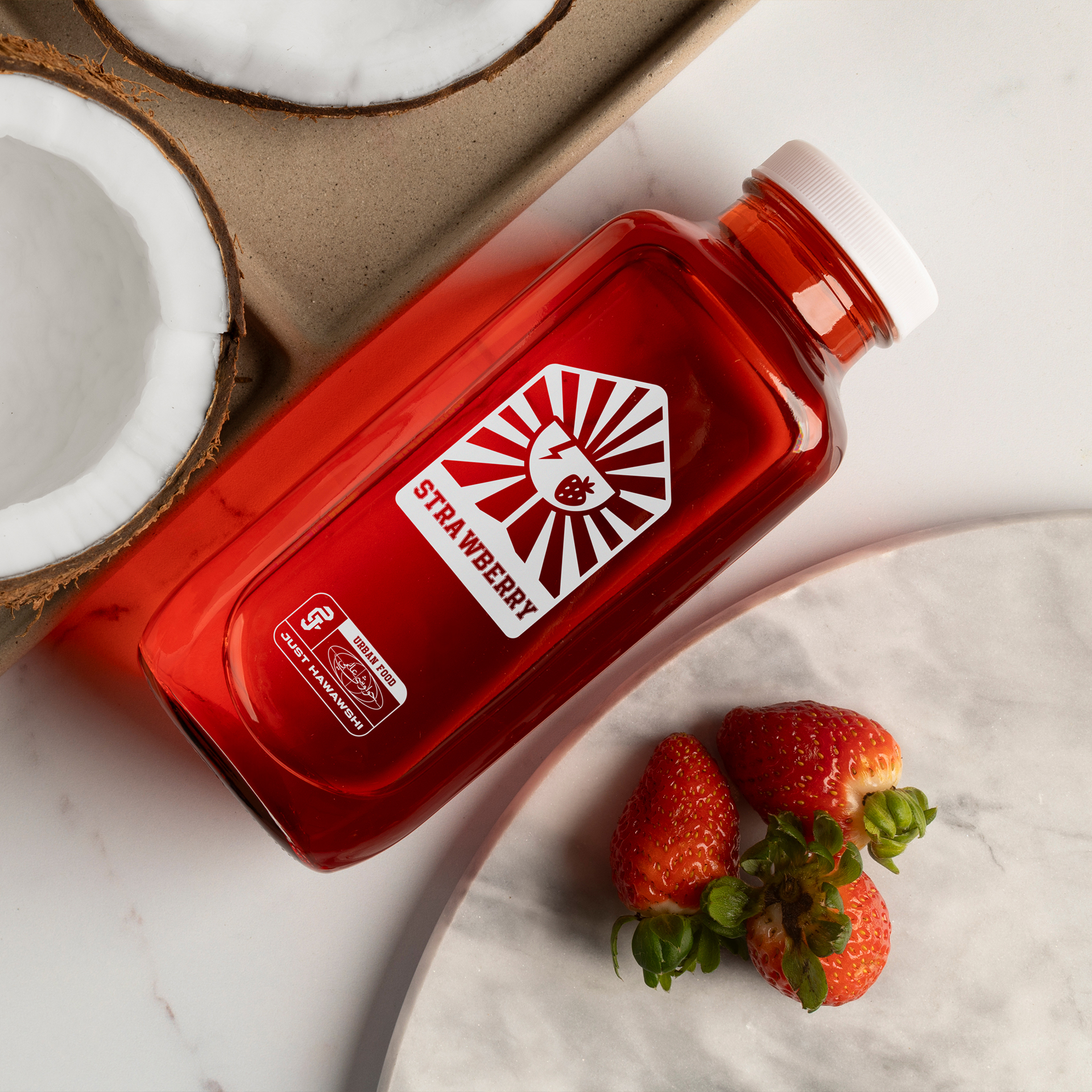
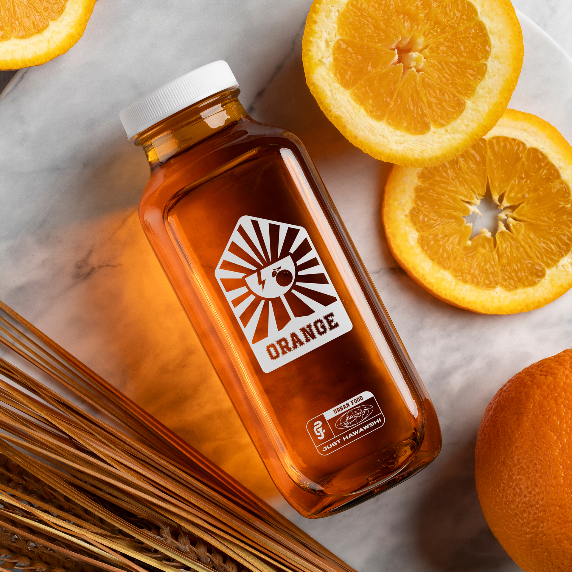
Drinks labeling system
Merge the iconic fragile icon, the emblem of Cairo, and the flavor icon of our juice to create a cohesive and eye-catching system for our bottle label design. By incorporating these elements, we connect our brand with the vibrant spirit of Cairo, while also infusing each juice flavor with a distinct and recognizable identity.
The fragile icon represents the essence of urban culture and adds a contemporary touch to our label design. Combining it with the emblem of Cairo further emphasizes our roots and the city’s rich heritage, creating a unique sense of place for our products.


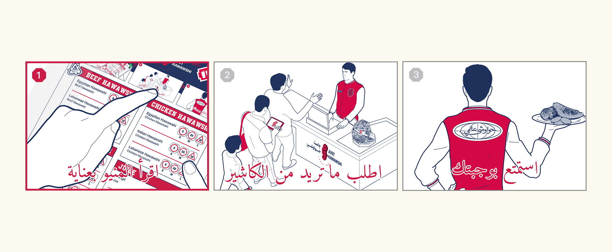
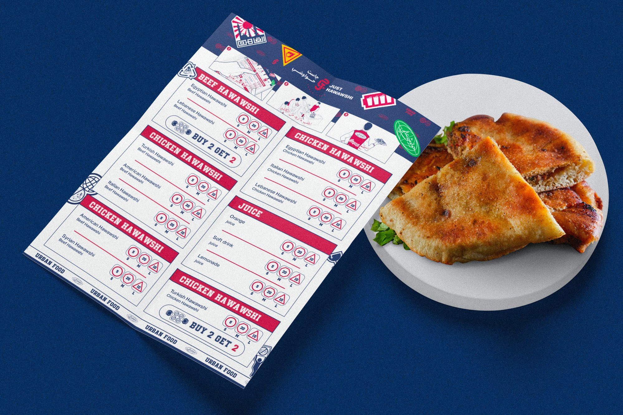
Mark / Manual
Our vector direction is inspired by the drawing style of manuals and product guides, commonly seen in urban culture. This distinctive approach communicates information clearly and efficiently, reflecting our commitment to quality and precision.
By using this style consistently, we create a strong and recognizable visual identity that resonates with urban inhabitants, enhancing our presence in the city’s food scene.
Selected Works

KimCam AcademyEducation
Kepler Cultural CafeFood & Beverages
Just HawawshiFood & Beverages

EMLE NotesEducation
One & AllRetail
AthwaqPastry
River EyeCareMedical