
Project Overview
Kimcam began with a simple act of sharing. A college student, wanting to help classmates access course materials, filmed lectures on his phone and uploaded them to YouTube.
This act of generosity sparked a movement. In just four years, Kimcam's engineering content has reached students across ten Arab countries, accumulating over 720,000 viewing hours.

Challenge
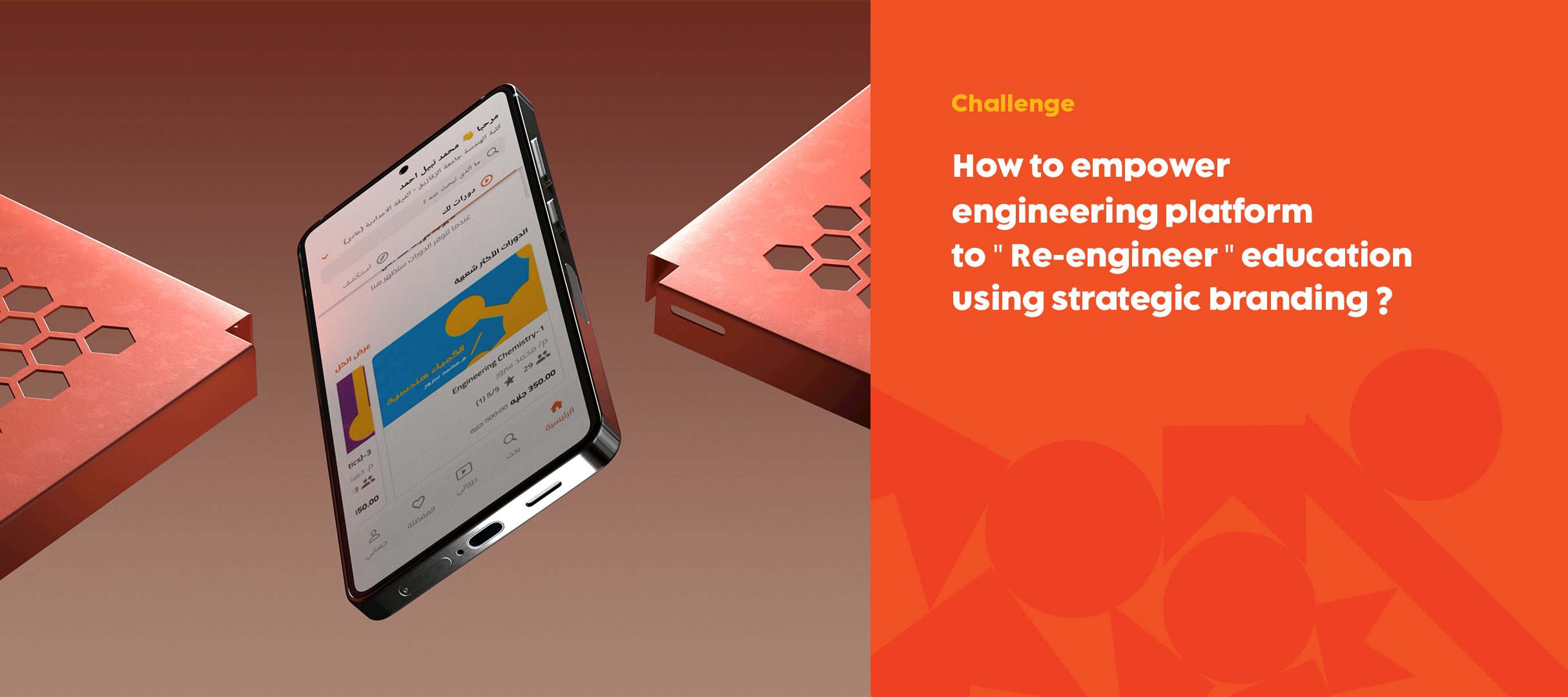
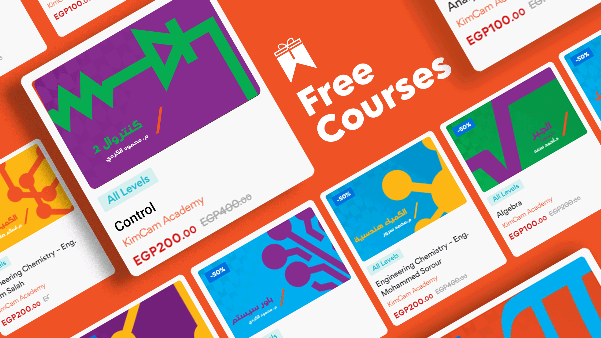
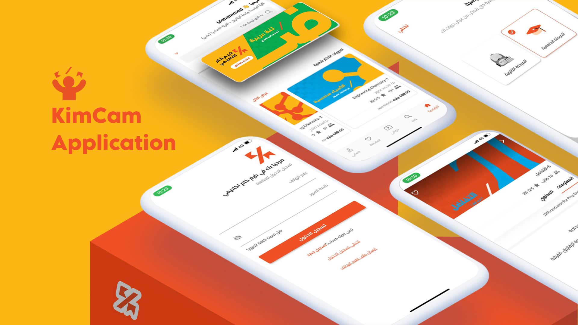
Kimcam's success created a challenge. While students valued their online lectures, they still craved the structure and interaction of traditional courses. Kimcam needed to bridge this gap, offering an engaging, comprehensive online learning experience accessible to all.
The pandemic in 2020 fueled a surge in online learning, and Kimcam faced a new challenge: a wider audience. They now catered to high school students, technical course providers, and everything in between. This influx of new content and users meant Kimcam's brand identity, focused on engineering content, needed to evolve.
Positioning theme
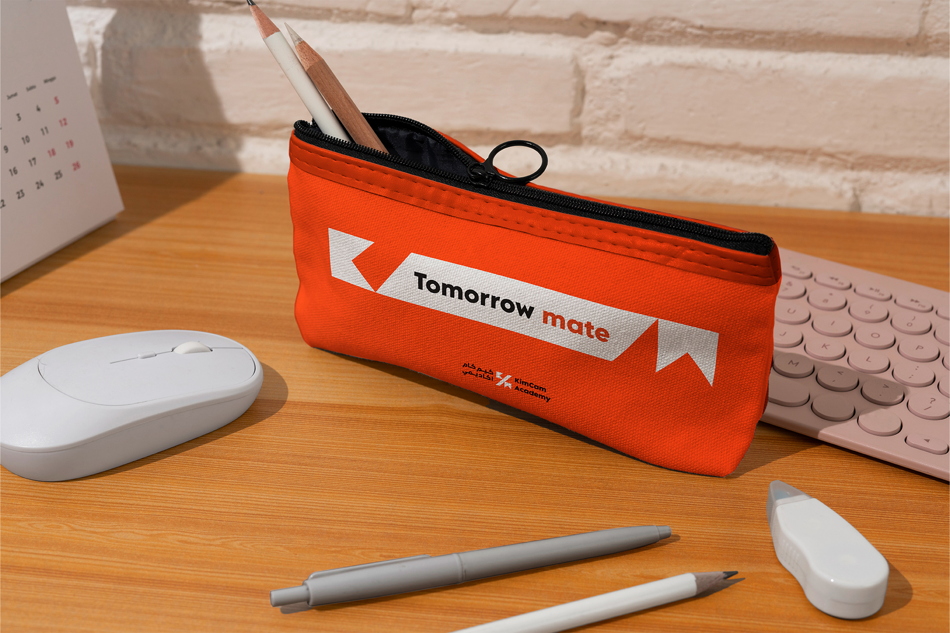
We wanted a tagline that felt like a friendly promise, a nod to the journey students takes with Kimcam. "Tomorrow Mate" isn't just about where you're going, it's about having a partner every step of the way.
They're not just an online academy, they're your learning buddy, high fiving you through those first high school exams and cheering you on as you master new skills and reach your academic goals.


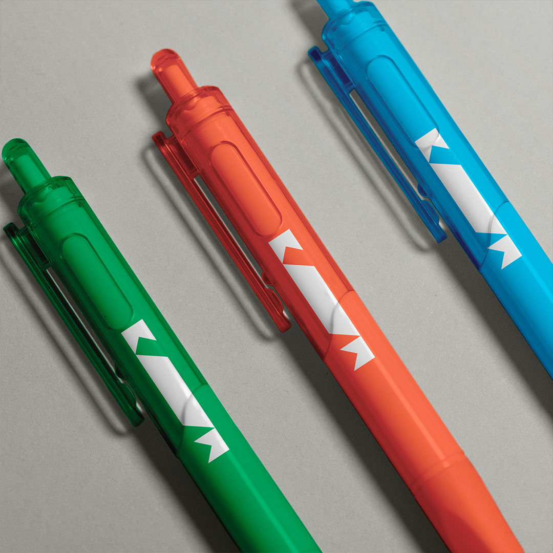
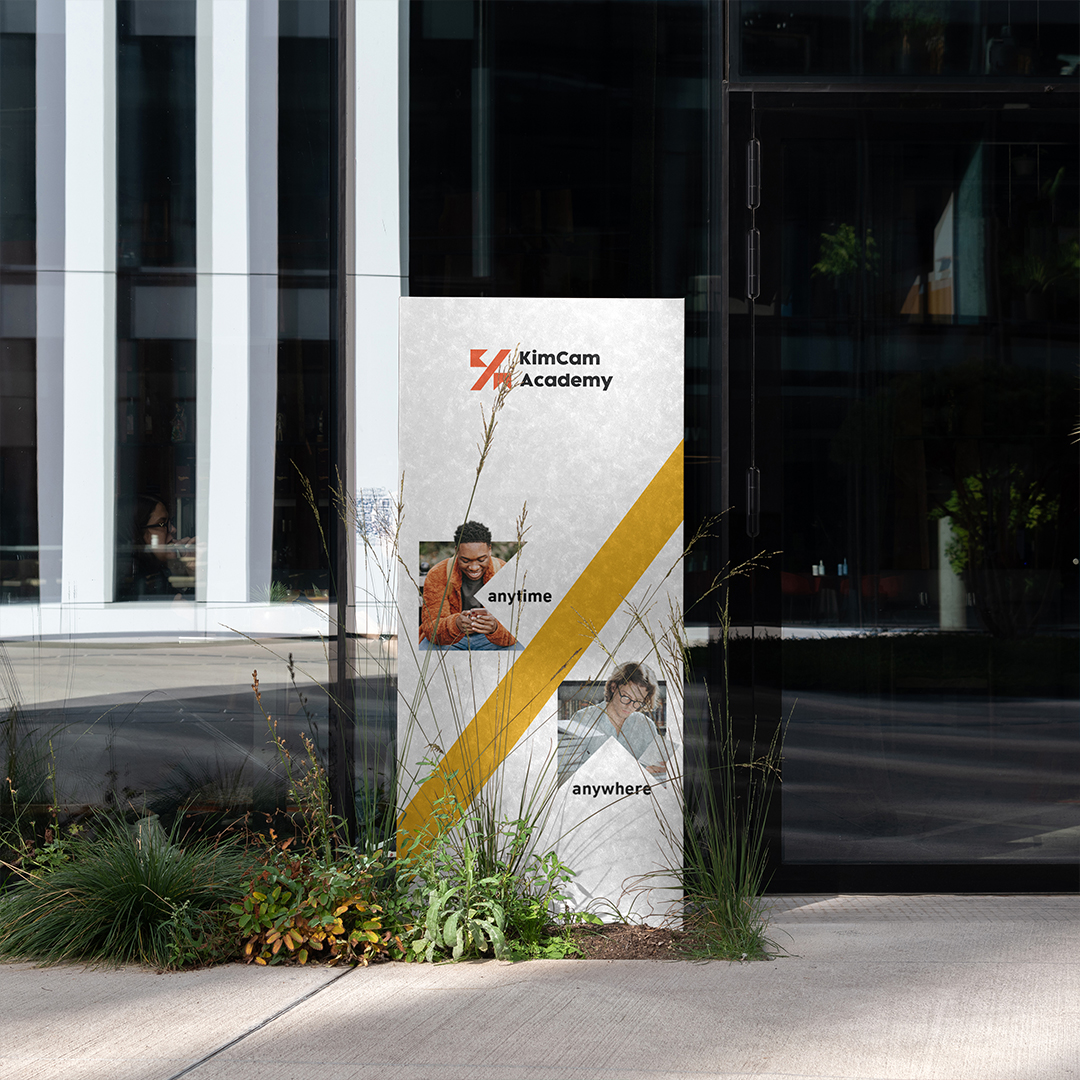
Brand Mark
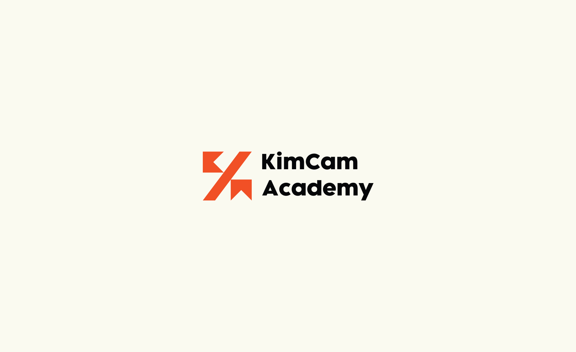
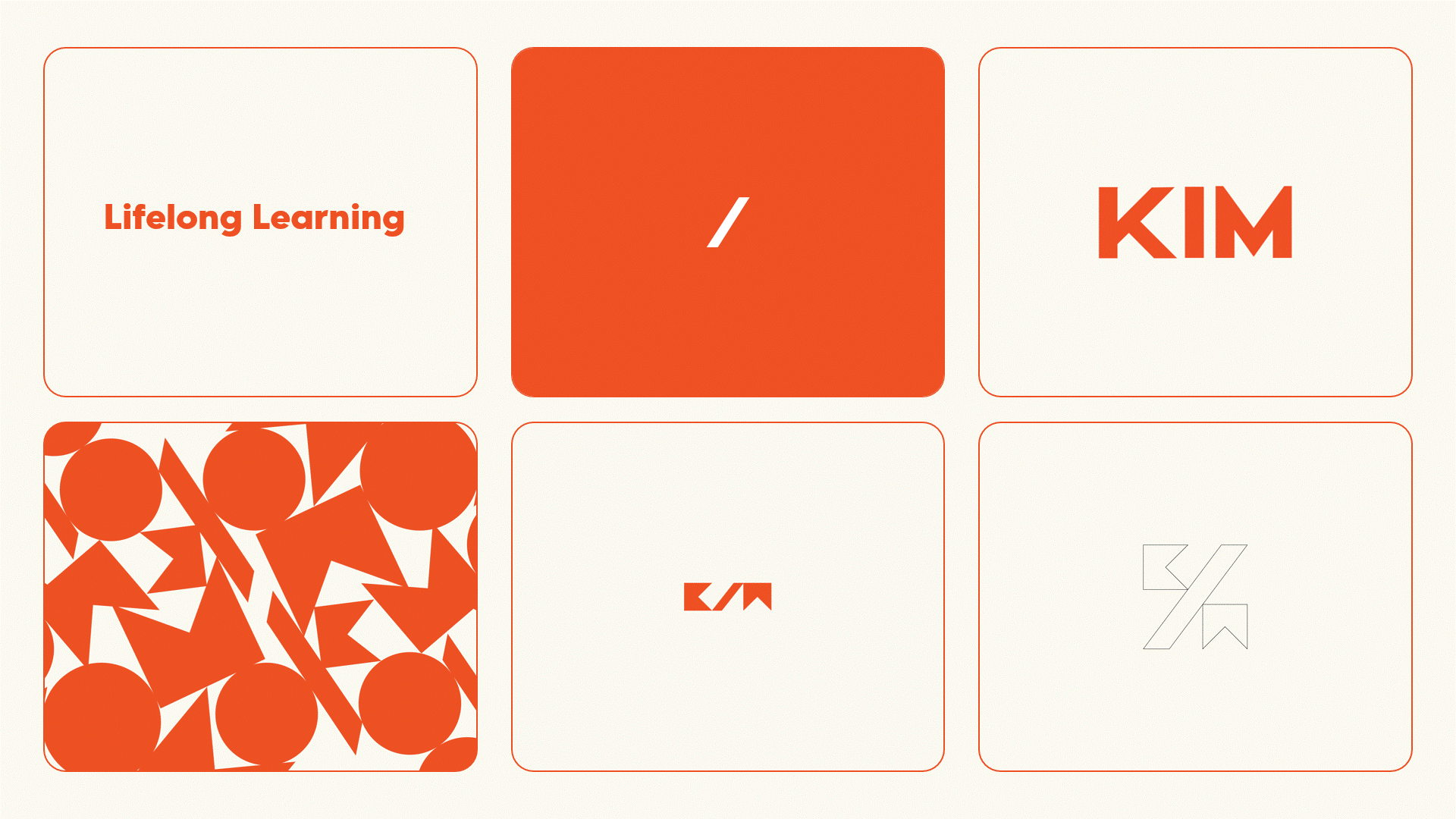
The Kimcam's logo distills the brand's essence into two simple yet powerful elements. The bookmark, cleverly incorporating the letters K and M, symbolizes knowledge, learning, and progress. It's a visual reminder that education is a journey, not a destination.
The bold slash between them is a dynamic symbol of distinction and disruption. The playful, friendly feel of the logo mirrors the brand's personality, inviting students to embrace their learning journey with enthusiasm and confidence.


Art Direction | Pattern
The Kimcam pattern is a dynamic tapestry woven from the brand's core symbols: the bookmark and the slash. Leveraging the logo's square outline as a foundation.
The bookmark, a symbol of knowledge and growth, intertwines with the slash, a mark of innovation and disruption. This interplay results in a pattern that is both structured and dynamic, reflecting the balance between traditional education and Kimcam's forward-thinking approach.


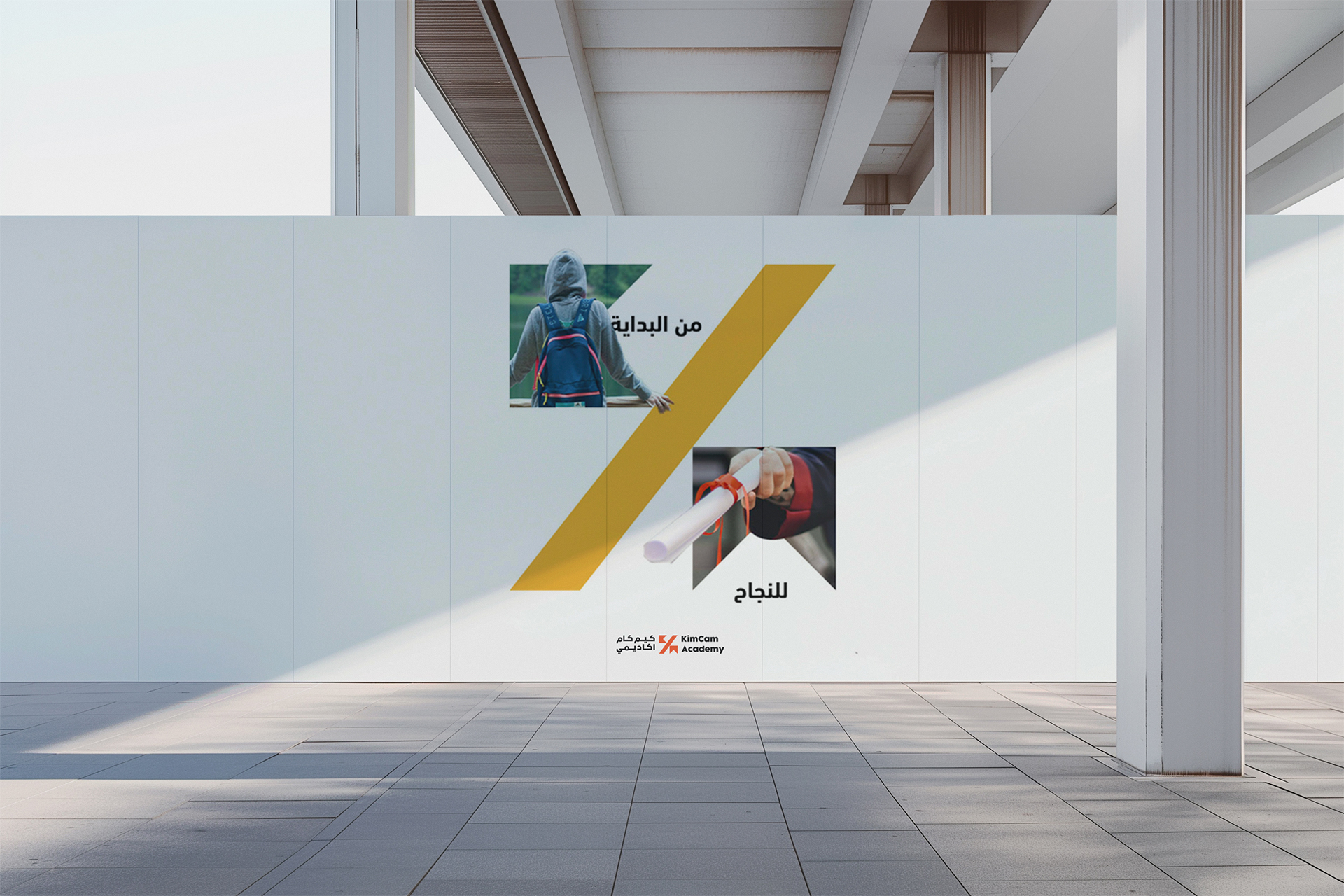
Art Direction | Before & After
The slash became more than a design element; it became the dividing line between past and present interactions between the audience and the brand.
The bookmark, a symbol of knowledge and growth, now holds the story of that evolution. The "Before" is represented on one side of the slash, showcasing the initial brand touchpoints and how audiences interacted with them. On the other side, the "After" reveals the impact of this interaction on them.


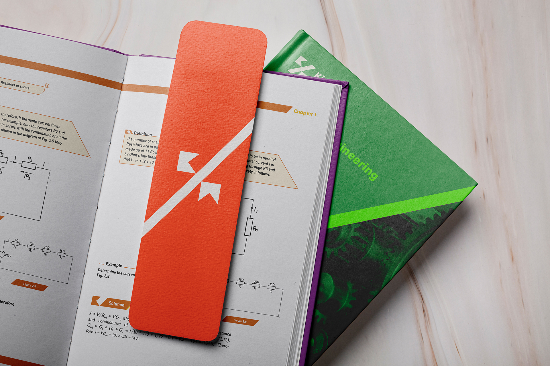
KimCam Kernel
Kimcam's commitment to accessible, engaging education extends beyond the screen. Recognizing the value of traditional learning materials, Kimcam transformed physical teachers' textbooks into a revamped book series.
This wasn't a mere reprint; it was a reimagining of the learning experience. By meticulously analyzing content and creating a cohesive design system, Kimcam ensured each book is not only visually appealing but also optimized for comprehension and retention.


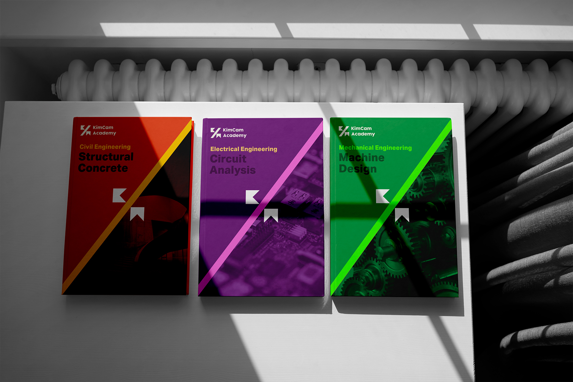
KimCam Kernel
Kimcam's Book covers are designed to be unique and inviting, reflecting the subject matter within a cohesive brand identity.
Bold visuals and the Kimcam color palette create covers that spark curiosity and showcase the engaging learning experience inside.


Selected Works

KimCam AcademyEducation
Kepler Cultural CafeFood & Beverages
Just HawawshiFood & Beverages

EMLE NotesEducation
One & AllRetail
AthwaqPastry

River EyeCareMedical